Dave's Most Popular Edinburgh Fringe Jokes
August 2021
Since Dave started to publish its "Best Jokes of the Edinburgh Fringe" in 2004, it has promoted a total of 144 jokes like these from established one-liners like Tim Vine, Milton Jones and Gary Delaney, from TV-recognised story-telling comedians like Zoe Lyons and Angela Barnes and from recent newcomers like Lew Fitz and Ross Smith. Each of those jokes has been heard by their Edinburgh show audiences, and seen by the readers of the various newspapers that report on the Dave competition. Then (and this is where the magic happens) people start retelling those jokes - to their friends in pubs, over lunch at woprk with their colleagues, and online on social media. Hilarity ensues. And then those people, who have just heard the joke from their friends, family or colleagues, go on to tell the joke in the future. The joke develops a life of its own, and keeps getting retold, independently of the original performance in Edinburgh. (Obviously, how often a joke gets retold depends on how funny the joke is, how easy it is to remember.)
Twitter is a great place to see this happening. Each joke told in a tweet has a timestamp (when the joke was tweeted) and a record of the appreciation (the number of likes, responses and retweets that tweet received). We can see how big an impression a joke made on Twitter, and compare that with other jokes to see which of the Edinburgh Fringe jokes was most popular with a Twitter audience. To see an overall perspective that aggregates and compares the appearance of all these jokes, it's possible to make a spreasheet of all the mentions of all the jokes and to plot them in a 3D bar chart using the x-axis to show each month from 2009 (bearing in mind that Twitter was only invented in 2006 and smartphones in 2008), the y-axis to show the number of times a joke appears on Twitter in that month and the z-axis to separate each joke.
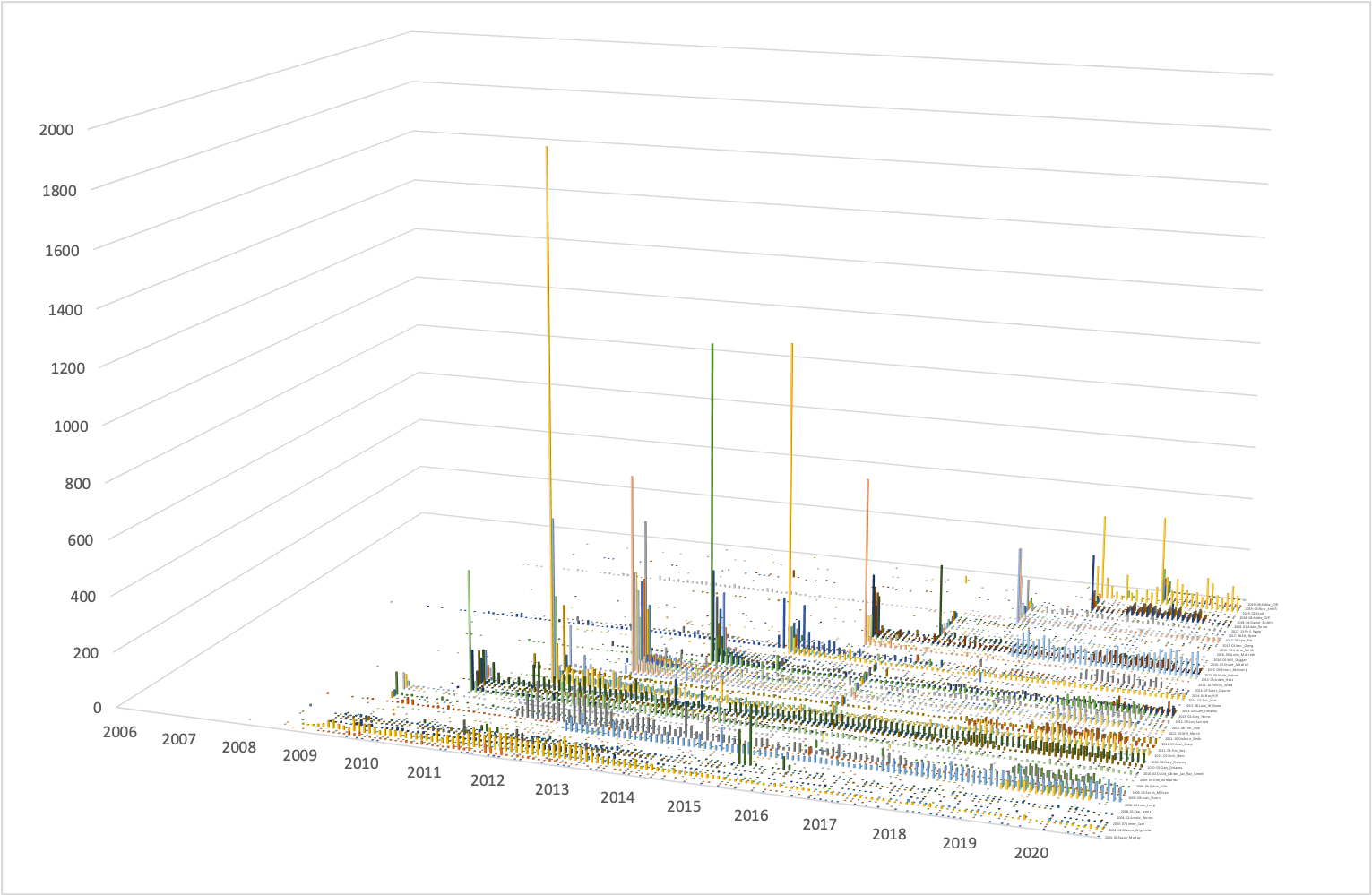
That does indeed give us an overview - it shows that there are huge spikes (lots of tweets) each August when the Best Joke list is announced. Other than that it is difficult to interpret all the much smaller columns. One problem with this approach is that there is too much data - there are 144 categories jokes - and Excel and Google Sheets normally support a much smaller number of colours to distingush the data categories. Even if it were possible to use 144 colours, this would be bad idea from a design point of view as people cannot discriminate between that many colours. The chart as it is does not tell a story because it makes everything look too similar. The challenge is that we need a way of visualising this data that highlights the differences between lots of kinds of data (a large collection of jokes) and also allows us to develop an engaging story that is relevant to the phenomenon under discussion (the telling of jokes).
.A Metaphor for Joke Telling
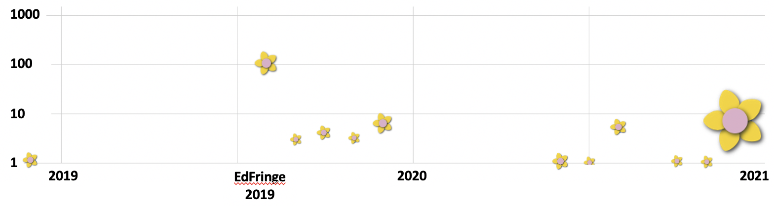
Jokes create two potential responses - an immediate laugh from the listener, but also a later retelling of the joke by the listener to a new audience. Jokes are stories that get retold. This isn't like social media "retweeting" or "reposting" where the hearer enjoys a meme and presses a button to pass it on to a new audience. Social media virality mainly comes from the original message being retransmitted between followers at the click of a button. Jokes are different, passed on in an oral tradition, by the hearer retelling them, in this case creating new tweets from memory, adapting and reworking the joke. Each joke retold is a new tweet. For an example I will take Ivo Grapham's joke, discussed in this artcle. Counting up all the tweets of Ivo's joke, and the likes and retweets they attract, yields the following monthly results.
| Month-Year | Tweets | Likes & Retweets | |
|---|---|---|---|
| X axis | Y axis | Size | |
| Dec-18 | 1 | 301 | |
| Aug-19 | 100 | 1179 | |
| Sep-19 | 3 | 33 | |
| Oct-19 | 4 | 36 | |
| Nov-19 | 3 | 5 | |
| Dec-19 | 6 | 288 | |
| May-20 | 1 | 396 | |
| Jul-20 | 1 | 11 | |
| Aug-20 | 5 | 175 | |
| Sep-20 | 1 | 6 | |
| Oct-20 | 1 | 9 | |
| Nov-20 | 1 | 26 | |
| Dec-20 | 43 | 76983 | |
How can we conceptualise these results? How can we visualise them?
Telling a joke is like sowing a flower seed; where it lands something grows (a laugh / a flower) but that flower also contains more seeds that can be further sown (as the joke is retold by the audience members and repeated to other people). You can think of jokes as being propagated like flowering plants; Edinburgh Fringe twitter is like a garden plot that gets seeds sown every year. Some of those seeds take, produce flowers that thrive and self-seed for further years. The bar-chart data visualisation can be reworked as a garden; a story about retweets and social media can be reframed as a story about comedy thriving and joke propagation, and a visual problem of displaying large number of data sources can be solved by depicting flower varieties.
Ivo's joke can be displayed as a bubble chart, where the normally circular bubble is replaced by a flower. The distance along the x-axis represents the time that the joke was told - here the month it was told in. The height of the flower (its position on the y-axis) represents the number of tweets (the number of times that joke was told) in that month. And the size of the flower is determined by the "popular response" to the joke in that month (the number of likes and retweets). Note that in this chart the y-axis is logarithmic, ie each step up the axis multiplies the number of tweets by a factor of 10. Also, the size of the flower (the area of the bubble) is related to the number of retweets in an indirect way to stop the flowers getting to small to see or too big to fit.
I have done this for each of the 144 jokes alliuded to above.
In the pictures below, a flower "species", i.e.a
particular number of petals, of a particular colour, and with a
particular coloured centre, represents one of the jokes that
won a Dave award. This species with five yellow petals and a pink centre
![]() represents Ivo Graham's joke. The colouring and
shape of the flowers are chosen to differentiate the 144 different jokes.
(Technical aside: the colours are randomly selected from an amalgamation
of colour palettes chosen to focus on the most "flower-like" hues,
so there are no greens and fewer blues than would normally appear in
an online palette. The algorithm for flower design is adapted from
represents Ivo Graham's joke. The colouring and
shape of the flowers are chosen to differentiate the 144 different jokes.
(Technical aside: the colours are randomly selected from an amalgamation
of colour palettes chosen to focus on the most "flower-like" hues,
so there are no greens and fewer blues than would normally appear in
an online palette. The algorithm for flower design is adapted from
Each of those kinds of flowers will appear at various positions along the flower border, representing the joke being retold at different times. Each time the flower will appear with a different height and size depending on its popularity at the time - its height indicates how many times the joke was independently told by different people, and its size shows how much of a response it got (in terms of likes and retweets) from those independent retellings. The image below shows the last three years of Edinburgh jokes appearances on Twitter, and highlights a few of the species from the complete garden border.
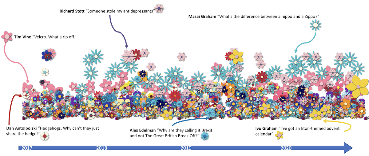
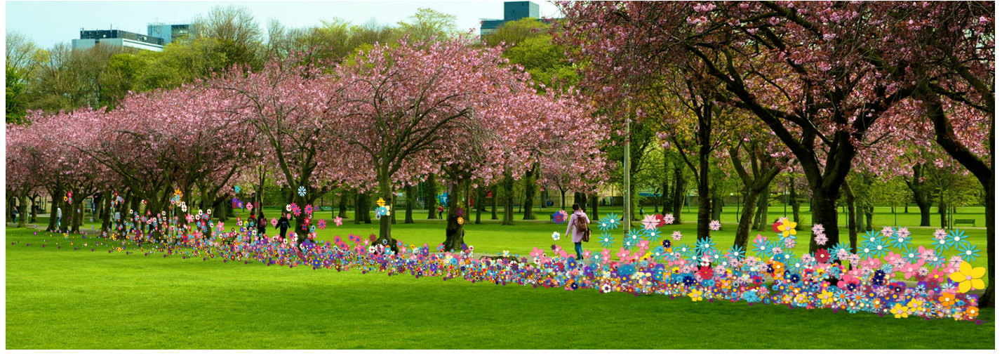
The complete garden border represents all tweets from 2009 to 2020. It is sparser on the left hand side because social media has only just been invented and the Fringe organisation (plus its audience and performers) have not yet adjusted to online life, promotion or ticket sales. Curiously, the extreme right hand side shows no dieback, despite there being no Fringe or Dave shortlist taking place due to COVID.

That particular garden border represents the timeline of Edinburgh Fringe joke appearances on Twitter, so by embedding it into a photo of the Meadows in Edinburgh, there is a statement about comedy performance, audiences and the role of Edinburgh as a place that makes that happen (a kind of comedy nursery where comedy gets planted, and planted on).
Complete Joke Catalogue and Notes on Future Work
- How Humour Propagates Through Twitter
- The Best Performing Jokes on Twitter
- If you would like to explore the Dave data interactively, and to see the complete list of jokes to better understand the visibility of joke-telling on Twitter, see The Dave Comedy Garden Explorer.
- Underlying all this work is a research curiosity about the role that the online world plays in the comedy industry. The Edinburgh Fringe has slowly built up its online infrastructure, and performers have gradually incorporated Twitter and Facebook in their marketing, to the extent that "bucket speeches" often request social-media likes as much as cash! COVID and lockdown have forced comedians and promoters to move towards online perfomances - and many have discovered that they don't entirely hate it as much as they thought. Received wisdom about "being in the room" and the necessity of intimate responses to a live audience no longer seem to tell the whole story about standup performance. This study looks at a very small part of the comedy industry, but also teases out some data about the inherent "virality" of joke telling, and of the way that material invented and performed by one person becomes common cultural currency in a way that conflicts with notions of intellectual property and performer rights. I have chosen to use simple, and easy to trace, comedy material that has been recognised by a major industry player and that has been firmly launched into the public space by media publicity - the Dave Best Jokes of the Edinburgh Fringe. This study is not intended to be comprehensive — other comedy festivals are available in other countries, and other social media platforms are used to tell jokes.
- Disclaimer: this was a personal project undertaken over Christmas and New Year 2020 and is currently in development. There is a task to do on data refinement as some of the tweets discovered are still false positives. The flower algorithm should be better tweeked, as should the spatial layout to better take into account the underlying data and the real constraints on flowers - a third dimension, more petal variety, and stems would be a good starting place!