How many cases are in each s2q10 category?
Some graphs, like histograms, box plots, and stem and leaf plots, require that the variables used are continuous. This is because those three types of graphs display the variance of the data around the mean, or average. In a categorical variable like health status, for example, there is no mean available. It isn’t possible to calculate a mean health status.
Therefore, when looking for graphs to use to illustrate the information in a categorical variable like s2q10, we have to look at other options.
Bar Graph
A standard choice for displaying the data contained in a categorical variable (or in several categorical variables) is a bar chart. SPSS can create this graph for you. Just select Graphs, Legacy Dialogs, and then Bar.
When the Bar Charts dialogue box pops up, choose Simple, as we are only looking at one variable at the moment. If you wanted to compare two (or more) variables in a bar chart, you would select a Clustered or Stacked chart in order to see the values of all variables in the same graph. Next, click Define.
You can see at the top of the dialogue box that you are able to choose what the bars of the graph represent. For example, you can build a bar chart illustrating the number of cases in each category or the percentage of cases each category represents. For our purposes now, select N of cases - this will build a bar chart representing the number of cases in each category. Next, find s2q10 in the variable list on the left and move it to the Category Axis text box using the blue arrow. Click OK.
In your Output window, you should see a completed bar graph like the one on the right.
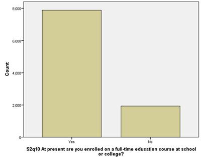
It’s clear from the bar chart that there are far more students who are enrolled in a full time education course than students who are not.
Also, notice that because we chose to build the graph using the total number of cases in each category, the y-axis of this graph is the count of cases. If we had selected percentage of cases, the y-axis would be percentage tallies.
Pie Chart
We can illustrate the number of cases in each category of s2q10 in another way by using the pie chart builder of SPSS. As there are only two categories in s2q10, a pie chart doesn’t make much sense, but we’ll build one anyway in order to highlight how to do it. First, select Graphs, Legacy Dialogs, and then Pie.
Select Summaries of groups of cases, which will tell SPSS to display the data by the categories of the variables.
Click Define.
Move s2q10 to the Define Slices by text box and then click OK.
The Output window will display a pie chart like the one on the left.
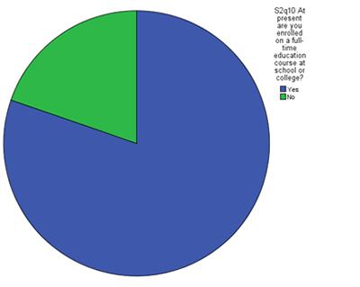
Once again, it is clear that the number of students who were enrolled in full time education is much greater than the number of students who are not.
Summary
You have used SPSS to illustrate the data in s2q10 in two different kinds of graphs: a bar graph and a pie chart. You can use these types of graphs to illustrate the data in the categorical variables, as they make the information in your variables clear and easy to interpret.