What is dark mode?
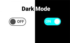
With the introduction of dark mode (night mode, dark theme), users can adopt a dark system-wide appearance. The dark mode inverts the device’s display to a light-coloured typography and UX elements on a dark background.
There are good reasons why users choose to set their devices to dark mode:
- it’s easier on the eyes, reducing digital eye strain.
- it reduces screen brightness, saving your battery life.
- it can improve content legibility, making it easier to consume content.
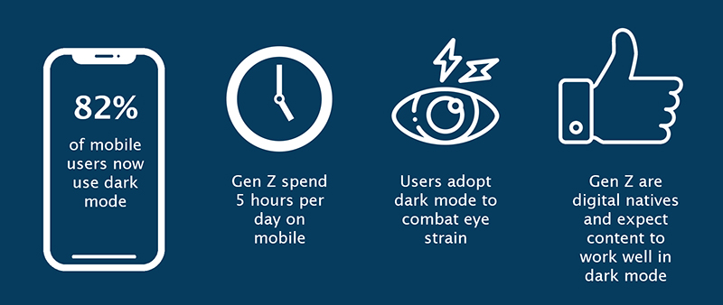
Caption: Gen Z use dark mode to combat eye strain
Gen Z, our target audience, are the first digital natives, constantly connected online and spending over 5 hours a day on their phones*. With so much time spent online, they use dark mode to relieve eye strain. It’s not just this age group adopting this setting, 82% of all mobile users now have the setting activated**.
The dark mode setting is available on mobile, tablet, and PC. All users can activate the setting system-wide or through an application. This includes:
- PC and laptop operating systems – Windows and Apple macOS
- Mobile devices – Android and Apple iOS
- Email Clients – Gmail, Apple Mail, Outlook
With such high adoption of this setting, we need to ensure our email communications are readable, on-brand and error-free. Basically, we need to ensure we’re meeting user needs in their own context, in the right place, at the right time. So, we decided to look into it.
What are the challenges in fixing dark mode setting?
There are a few key challenges in implementing dark mode. These are:
- each email client and the operating system will render emails differently.
- even the age of the device can cause a problem.
To combat it, the best way to test and check emails, is through an email optimisation tool, like Litmus. This resource performs tests on over 70 email clients, including dark mode simulations.
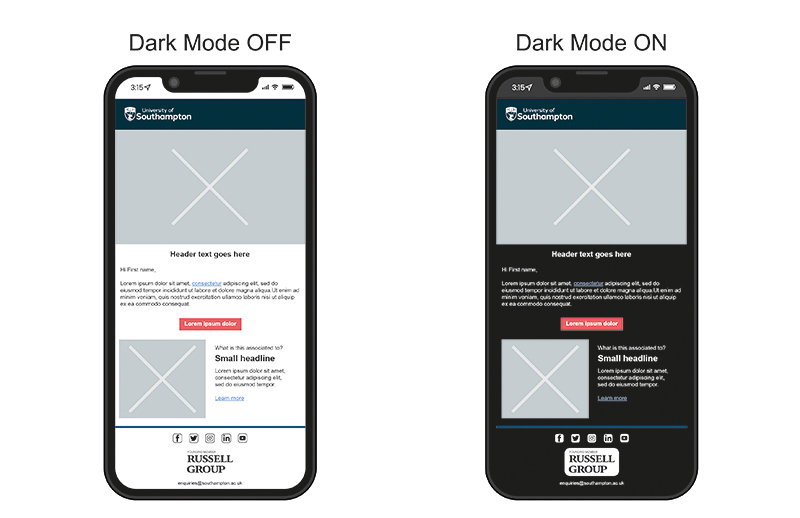
An email may look great with the dark mode setting turned off, but tests using Litmus indicate that elements of the University email template are affected in dark mode.
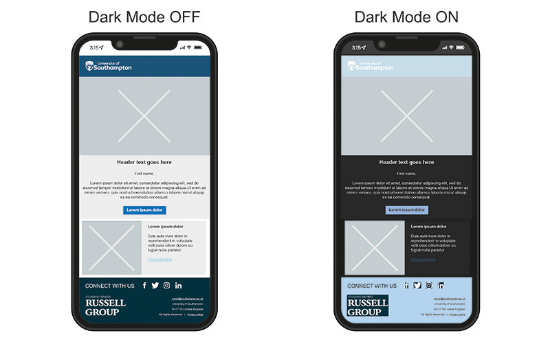
Caption: The difference between dark mode on and off, colours invert
The image above details two screens with the dark mode off and on. The screen on the left displays the email with the dark mode setting turned off. The screen on the right depicts the same email in dark mode. Here key brand colours are inverted, causing the email to be displayed incorrectly.
Our university is not alone, brands are affected too. Logos, text and call-to-action buttons seem to disappear. This isn’t the outcome any brands wish for when the purpose of an email is to engage with our customers, community and so on.
So, what do we do? Develop a plan for success
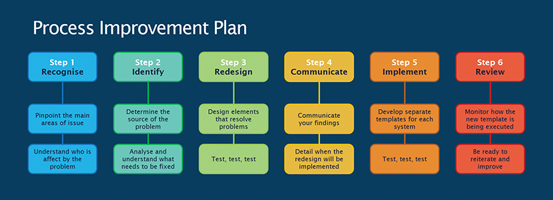
Caption: A process improvement plan setting direction of work
Before any work is undertaken, we developed a process improvement plan to:
- outline the purpose of the work,
- set direction, and
- break the workload into smaller, more manageable stages.
First, we need to recognise the main issues, understand their impact, and identify who could be affected.
Who is our audience and what mail platforms and devices do they use?
Our standard email template is at the heart of our digital communications. We use the template to build engaging emails to prospective students, to communicate with enrolled students and staff as well as other groups such as our alumni community. Each audience interacts with emails differently.
It is important to understand which email client, and platform our target audience uses. Otherwise, we could focus on the wrong technology.
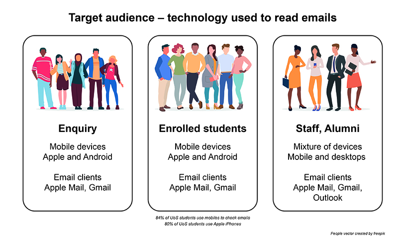
Caption: The University’s main target audiences and how they interact with emails
When analysing our target audience, we identified three email clients (Apple Mail, Gmail, and Outlook). Whilst younger recipients prefer mobile devices, staff and alumni prefer a mixture of mobile and desktop.
Pinpoint the crucial issues
To determine the source of the problem, we carried out extensive testing using Litmus to identify the problem.
Inconsistencies between email clients and operating systems provide different results in dark mode. Most notably colours render differently. Whilst most images are unaffected, Gmail inverts smaller images such as small social media logos.
The diagram below details which operating system and email client combinations experience problems.
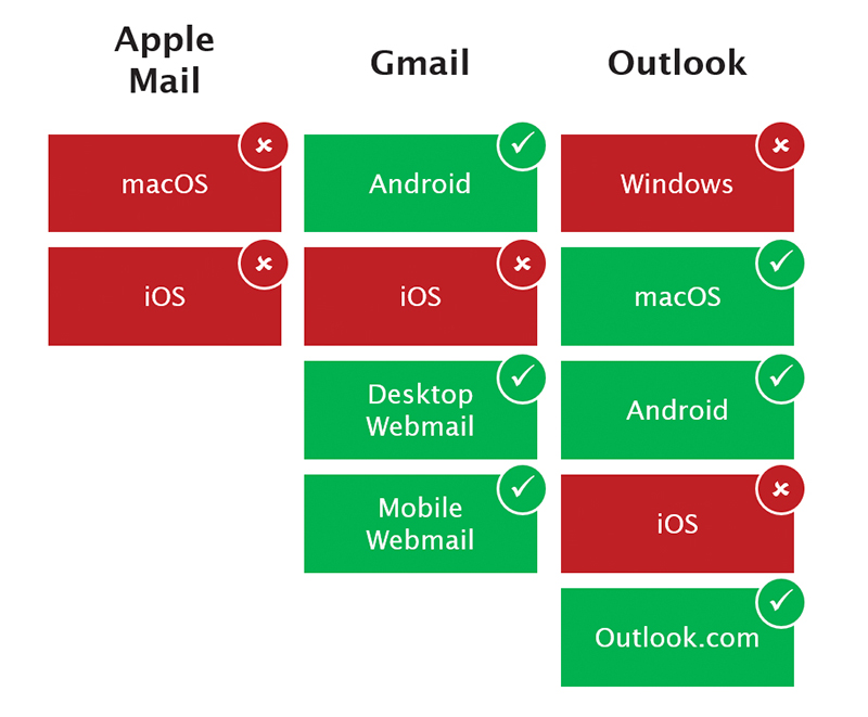
Caption: The results from extensive testing to identify which email clients and operating systems experience a problem in dark mode
What is the biggest problem?
The dark mode function inverts colours. All colours coded in the email can be affected. Colours of banners, call-to-action buttons, and hyperlinks, shift in colour.
Like all brands, the University provides a range of colours to create a visual impact and to distinguish the brand. But would these colours be affected by the dark mode colour shift?
The answer is yes. The chart below depicts what happens to our brand colours in dark mode and across several email clients. The result looks like a piece of modern art.
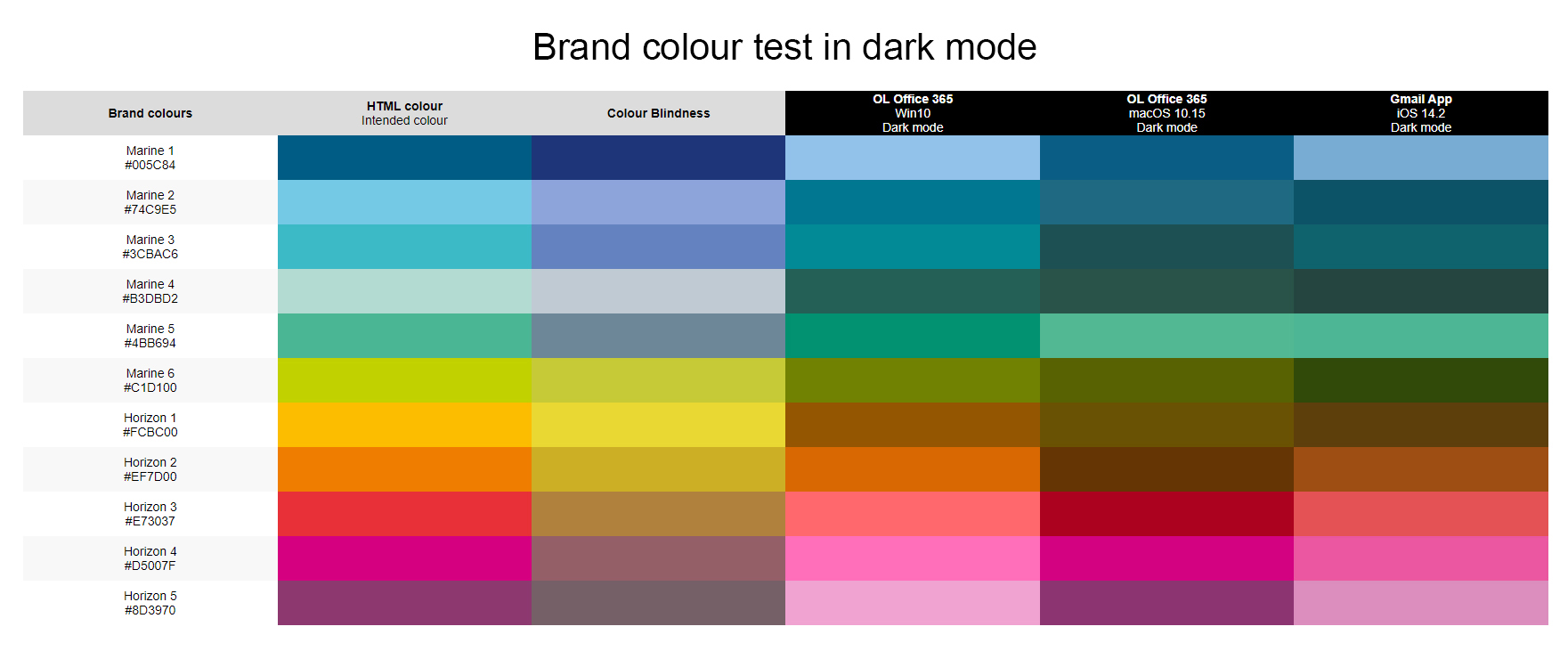
Caption: This may look like modern art, but is the colour shift of our brand colours in dark mode
Where the brand colour Marine 1 is utilised in our campaign emails, the colour will become lighter in dark mode. Whilst the lighter Marine 2 will become darker. This colour shift will affect the effectiveness of any button or hyperlink.
The challenge is to choose colours less affected by the colour shift for each part of our email template. With the help of Steve Wise, another member of the Digital User Experience team, we reviewed the test results to identify how to resolve the issues.
Redesign of the email template
Our testing identified that simpler email template designs are the best for replication in dark mode. The areas of improvement included:
- simplify the template design,
- ensure template is accessible and renders through all email clients,
- remove background colour in content blocks,
- introduce a single image replacing the header banner and logo,
- simplified footer,
- develop different social media icons
Creating the code to target dark mode
The coding has been a challenge. Not all email clients work the same way. Each element needs specific code for each email client and operating system.
Using the Litmus system, each piece of code was tested. Some worked, most did not. We conducted a total of 3,000 email simulations before we created a stable working template.
We developed separate code to create the email style, CSS, to target specific operating systems and email clients:
@media (prefers-color-scheme:dark) controls elements for Apple Mail and iOS.
[data-ogsc] controls elements for Android and Outlook.
Specific code targeting Microsoft Outlook, ensures text inverts correctly and is readable on a dark background. Without this inclusion, Outlook may not invert text correctly.
The key with any development is to ensure that the email looks and renders the same through all email clients.
Caption: The new University email template renders correctly in dark mode, thanks to some extra code
Hyperlinks and accessibility
Hyperlinks provide a link to external content and are identifiable by underlined text. This underline can cause readability issues as it cuts through any text with a dropped tail (g, j, p, q, and y).
Through code, we can remove the underline and replace it with a padded borderline below the text.
During testing, we found that Outlook removes this border and would need more code to insert the underline to hyperlink text. More code is not better.
The decision here is to retain the standard underline to hyperlinks. It works through all email clients and is a simple solution.
Implementation
The email template will be used in a broad range of CRM applications (Microsoft Dynamics, Connect, Mailchimp), each requiring separate templates. Depending upon the system, we will implement new code to allow the template to function correctly in the CRM system.
In Summary
We are pleased with the progress to redevelop our template, to better address the challenges of dark mode compatibility.
We’re looking forward to seeing how our users will respond to the new template as we start to integrate it into our upcoming campaigns and wider communication.
Many thanks to all my contributors: Doug, Steve, Ayala and Jonny.
Links to articles and further resources:
- Generation Z Statistics by 99Content *
- What is dark mode? by Night Eye **
- The Ultimate Guide to Dark Mode for Email Marketers by Litmus
- A look at Gen Z mobile behaviours by Business of Apps