Last week there was no Weeknotes from me. Life has just been a little bit busy with all those long bank holiday weekends, and shorter weeks. So, this post will be a catch up on the past two sprints 5 and 6.
Why call this post a content design revolution?
I know calling it ‘the content design revolution’ is a bit dramatic. Although it isn’t quite a revolution, it’s still a good way of grabbing your attention! 🙂
I have noticed that, since we started the OneWeb consultation and the course pilot, more colleagues are becoming interested in content design as an approach for user-centric web content. Why? Because it solves many of the issues modern websites have, including ours.
The issues
One of the biggest issues with the website is that it’s hard to find a sustainable, user-centred solution for producing and managing quality content at scale. Our content problems are like every other big organisation.
We have:
- Too much content
- Unintuitive user journeys
- Lack of governance
- Big flabby digital channels
- Content that is ego-centric, not user-centric (organisational needs vs user needs)
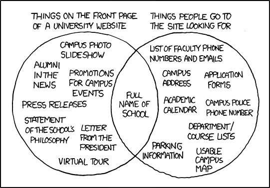
Organisational needs vs. User needs, source: xkcd.com
What we did
Enter content design – ta-da!
I don’t want to keep highlighting problems without ever finding a solution. There is a solution, a tried and tested one!
Remember the user needs workshops from last year? We’ve introduced the user stories that emerged in those sessions as a starting point. Hundreds of colleagues have participated and bought into the user-centric approach behind OneWeb.
And for the past two sprints we’ve been creating content for all sample course pages, with the ultimate goal of simplifying our course page content, making it more readable and applicable to our users (prospective students), and more importantly – using the language that would appeal to them.
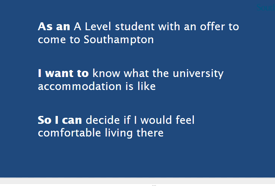
An example user story
We haven’t been working on it in isolation. We are talking to Institutional Research, we refined our testing, modified the baseline due to time constraints and have looked at what we could realistically achieve since we are now halfway through the project!
Sue and Chris in the web content team have also finished writing up the task-based study and launched it to the world via the Open Day emails. We also put in place the building blocks for the testing and the navigation by using card sorting and Treejack information architecture validation tests. More on this in the forthcoming sprints.
Build and design
We created three versions for each of our sample course pages:
- As is – this is our current course page template
- HEFCE – a template based on the HEFCE guidelines with some slight modifications to the current template
- RAD – a radical content design version. We are building the design for it in this current sprint (sprint 7)
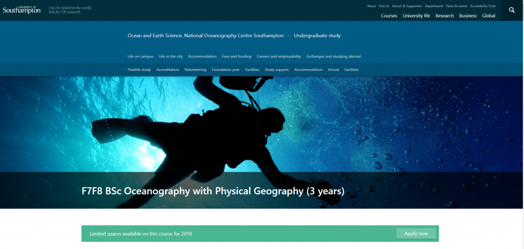
An example Hero Banner from our Depth framework
All of these have been plugged into our content workflow software, GatherContent, and are ready for our fact checkers and Single Point Of Contact (SPOCs) to test the governance process. As it is a busy time of year, we’ve asked them to fact check the RAD template and only comment on factual accuracy. Communication to SPOCs was sent out this week.
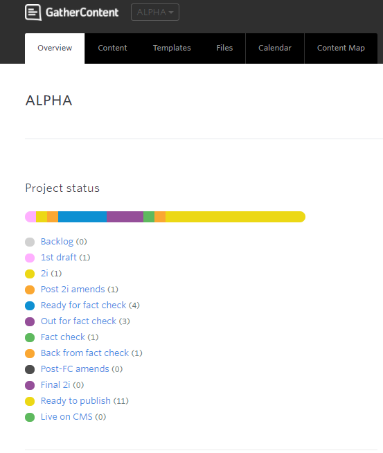
A screenshot from our GatherContent project status
Needless to say that all three versions, for each course, will be tested in our user research to establish the experience and to ensure that they’re getting what they need out of the content.
What we learnt
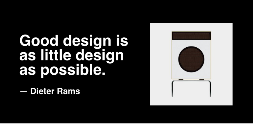
Less, but better
Our UX and frontend developer, Jon, has created three different frameworks in flat HTML templates for us to put in front of our users.
Source: uxdesign.cc
So what have we learnt?
- We always need more time, whether it is design, coding or conducting user research, but we need to deliver what we can with the time we actually have.
- Reaffirmed that simplicity is the mother of usability. A good design speaks for itself, without asking the user to commit much effort. If the user can intuitively deduce what to do with our design, that’s brilliant! If they need instructions, that’s not so good… we learnt to concentrate on the essential aspects, so that the template designs are not burdened with non-essentials, therefore making it better for the user. Back to simplicity.
- We need to start planning the user testing a lot earlier, especially where there are more stakeholders whose time is short
- The user research process would be helped by developing a set of templates for user testing briefs, and plans that prompt the right questions
What we’re doing next
- We are going to rewrite the task-based study and send this out via YouthSite
- Chris is working on the build of the card sort / tree test.
- It is also worth us taking a look at some of the data that has already come through, to see if there are any patterns of feedback developing that might inform the iterations.
- We will be working to complete the RAD design and slotting all new content in
Final thoughts
Doing things right takes time. We’re very keen to show the importance of content design once we have metrics to compare before and after.
Show & tell
As we’re heading to the finishing line of our Alpha phase, we will be carrying out a show and tell event for all interested colleagues, and would encourage you to attend.
The show and tell will be on Tuesday 3 July at 2pm and we will be sending out more details in due course. We will also hold an exclusive session for the OneWeb Advisory Group in the morning.
The afternoon session will be filled on a first come, first served basis. If you’re unable to attend, we will be sharing the presentation, and filming our wider show & tell with all of our stakeholders.
That’s it for this week. Have a good weekend!