The Digital Team darkened the doorsteps of many a lecture theatre over the last fortnight, coming together to explore the ins and outs of good content design. It’s been an enlightening experience, and we’re excited to start applying what we’ve learned to the University’s web presence.
What is content design?
A content designer is someone who puts their users’ needs at the centre of everything they create. It’s about far more than just how a website looks, although aesthetics certainly play a part in the process. Rather, it’s a question of paying attention to what our users actually want or need to do when they use our website, and catering to those wants and needs in a way that makes it as easy and painless as possible for them.
Why is this important?
Traditional organisation-led web design has got us so far, but it has also led to significant problems which prevent our users from finding what they need, and tie up resources that we could better spend elsewhere. It is a fundamentally ego-driven approach to our web presence, with little consideration for whether this actually benefits the University.
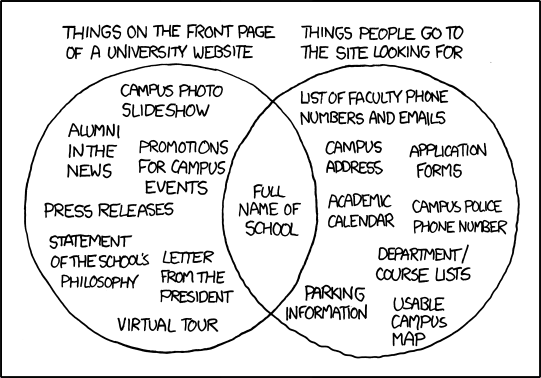 Source: xkcd.com
A few of these problems include:
- Duplication – creates confusion among users, and increases the chance of out-of-date information being featured on our website.
- Gaps in content – a failure to emphasise the needs of our users, over our own opinions of what is valuable, leads to missing content.
- Poor SEO – with search engines representing a major avenue into our website, poor Search Engine Optimisation means users have a much harder time finding what they’re looking for.
- Hundreds of thousands of web pages where a few thousand would do the same job more effectively.
- An unmanageable, expensive website – with all of our time spent maintaining this unsustainable behemoth, we can’t give our users what they actually want.
The solution? To simplify our content, making the user journey as simple as possible.
You mean dumb things down?
No – quite the opposite.
“People who are well-read (aka not dumb) read a lot. They don’t have time to wade through jargon. They want the information quickly and easily—just like everyone else. Wanting to understand quickly has little to do with intelligence. It has a lot to do with time and respect.” – Sarah Richards – Content Design
There is a huge difference between oversimplifying our content at the cost of vital details, and recognising that our users have neither the time nor inclination to spend hours on our website. Translating unnecessary jargon, sifting through irrelevant information, and picking their way through a maze-like website takes time and effort they would much rather spend doing something else. They have come to us for a purpose and our job is to comprehend and fulfil that purpose. This can be expressed as a user story:
- (Who) As a… (prospective student)
- (What) I need to… (apply for halls)
- (Why) So I can/So that I… (have somewhere to live next year)
We must come to understand that our website is not a pulpit around which our users will gather to hang off our every word. Instead, we use empirical research, experimentation, and user feedback to inform content creation, from adapting our tone of voice, to changing the way we arrange images on a webpage to prioritise the most important information.
OK – how?
The process begins with gathering all of the evidence we can, to inform our first steps. This includes an understanding of established lessons in human psychology, such as the fact that people will typically avoid working or thinking harder than they absolutely have to, to achieve a goal. Some other factors to consider:
- Humans are generally not good at multitasking
- Focus users’ attention on one task at a time
- Minimise distractions
- We all inevitably make mistakes
- Break tasks into smaller steps
- Allow users to undo/reverse/save and return to tasks
- Memory is inherently flawed and deceptive
- Keep content simple so users only remember what is essential
- Make important things stand out
- Structure information and objects in a way that makes relationships between them clear and logical
Paired with data that show how users interact with our current website, as well as direct feedback and a little bit of experimentation, we now have everything we need to make informed choices when the time comes to create our content.
“Anything designed without being informed is, at best, a pretty picture.”
What’s next?
We prototype.
A prototype is the first step on a journey towards a ‘finished’ product. Although, with our new methodology of constant iterative improvements, it’s never really finished.
Say you have a sloth. He wants to get to a local coffee shop for a little pick-me-up, but by the time he’s made it there every day, the shop is already shut. A prototype solution might look like this:
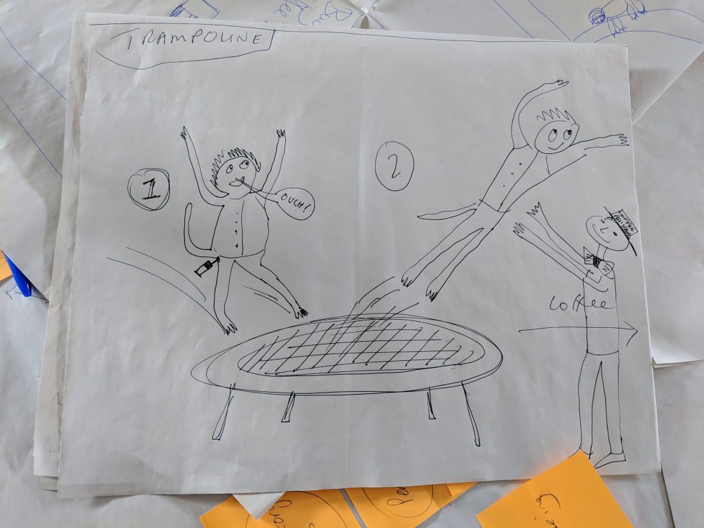
Adrenaline shot-fuelled trampoline adventure.
Or this:
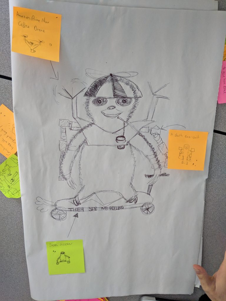
Propellor-driven exosuit/scooter hybrid of dreams.
It might not be an ideal solution, but that’s OK for now. The first phase is just to sketch ideas, followed by a round of criticism from all available perspectives.
This cycle continues as you work towards a viable product or service, with additional rounds of testing and research thrown in at the right time, until you have a functional (in this case) sloth coffee delivery system.
The process is organic, flexible and fast. It’s not like building a skyscraper, where you start with the foundations and steadily work your way up to completion. Instead, we work in cycles, making incremental improvements as we go until we reach a workable version that has been thoroughly stress-tested and informed by the very people who use it.
We hope that everyone in the University community can recognise the benefit of this approach to content creation, both to our users and ourselves, and we’ll welcome every opportunity to discuss it with you at length!
If you have any questions, please get in touch. Thank you.