I’ve been planning to write this blog post for a good 6 months now, if not longer having just been through a significant digital transformation programme, OneWeb, within a large complex organisation. But I got slightly distracted when I read Mike Monterio’s book Ruined by Design.
His book is about the:
- power of design to influence
- lack of designers’ involvement within the design process
- absence of ethical considerations within the design process of products and services
It’s essential reading for any designer (or indeed non-designer), and it inspired me to write about a topic that has been on my mind for some time: emotional connection with users, and the point at which creatives stop being cool.
I’m going to keep this blog post specific – it’s a thought piece with some tips and hints on how to avoid commonly held misconceptions, with some practical advice and guidance when it comes to designing experiences.
Make it pretty (and make it work)
In the digital user experience team we are committed to representing the voice of our users through the design of services that meet their needs. Having just been through a big digital transformation programme, we’ve learned how to take a user-centred design approach to our work, because we recognise that by solving users’ problems, we will also be able to meet business objectives.
Many organisations say they value the importance of good design and ‘putting our customers at the heart of all we do’, while their services and systems fail to back up that corporate promise.
On reflection, there is a good reason for this. Generally speaking, digital functions grew out of physical functions such as Marketing, Communications and IT. These were traditionally the ‘go-to’ areas that were commissioned by stakeholders to create stand-alone platforms, creative campaigns and innovative solutions. As a result, so many companies still focus on stand-alone innovations before people. There seems to be a shared mythology that pleasing aesthetics are all that is needed to capture attention, elicit engagement, and smoothly convert another happy customer. But the more difficult question, with more up-front effort, is does it DO what it’s SUPPOSED TO DO in the first place.
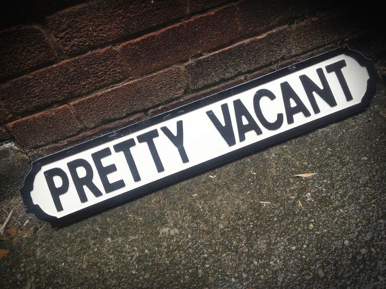
Caption: ‘Pretty Vacant’ sign, courtesy of Handsome Signs, Etsy
You don’t go to the cinema to listen to the radio
We want people who visit us in an online or offline environment to have a seamless, frictionless experience, with very direct outcomes.
We want them, for example, to:
- feel connected with us
- remember us, even if just for a quick moment
- become our advocate
- tell their friends and family about the outstanding work we do
- carry our message in a crowded and noisy world
So that…
- they buy our goods and use our services,
- we can reduce our support cost and burden
- deliver against strategic outcomes… you get the idea!
We hope that in the longer term, it might even translate into a stronger brand advocacy, loyalty and eventually increased revenues. The ultimate utopia: users’ needs meeting business’ needs.
But emotional connection is about more than just pretty pictures and impressive-sounding vocabulary – it is about meaningful content that helps people achieve something they set out to do. In this scenario, a user walks away from their interaction with us feeling satisfied, and with an innate sense of the great care we took to meet their needs as easily and clearly as possible – now there’s a recipe for brand loyalty.
The way we choose to share this content matters, and certain mediums (or channels) are better than others to get that impact. I’ll be the first to admit that a web page on its own is hardly ever enough.
We need to choose the right tools, or channels, for the right job. Just like we can’t expect people who go to the cinema to listen to the radio: select the best tool available for the task.
Let me explain.
Art vs Design
The basic definition of design is to create, fashion, execute, or construct according to plan.
Art is defined as something that is created with imagination and skill and that is beautiful or that expresses important ideas or feelings.
In Ayesha Ambreen’s article: Aesthetic vs. Function: nailing the balance in UX design, she talks about the similarities in the two concepts but also how they are different in their own ways. She says that design is a deliberate practice with intentions to create with a specific purpose and plan. Art is an expression of the artist for decoration, and meant to be interpreted in any number of ways.
Good art is always interpreted, leaving the observer to find the missing pieces dropped on purpose. Whereas, good design should never be open to interpretation; it should be easily understood. In fact, good design when done well is invisible to the user (Jared Spool).
My reflection of that is that in many organisations, ‘design’ is often mistakenly interpreted as indulgent frosting on a functional interface. The problem with this view is that if design and users’ needs are not considered from the start, it’s extremely hard and costly to do something about it later on.
There’s a good reason why many corporate portals or systems don’t function to meet requirements. They have not been designed from end-to-end with both a carefully considered user and outcome in mind. Factoring into your business case two weeks of UX design before the end of a project may meet the requirement of ‘doing some design’, but in reality won’t make the user experience any better!
You cannot fix a cake once it’s been baked. Mike Monteiro’s wise words – not mine. Mike says critique should be embraced at every stage of the design process, by the very people who’ll be using your service. That’s how you increase a project’s chances of success. Get feedback early and often to decrease the overall costs of maintenance, repairs and doing big projects time and time again!
The extent to which aesthetics matter
Aesthetics do matter. It is a simple fact that good-looking products and user interfaces are perceived as more valuable and having more positive qualities, even if it’s not true! This is referred to as the aesthetic-usability effect. Users tend to perceive that things which look better, will work better, even if they are not actually more effective or efficient.
Really good design takes this into account. It makes sure that content is presented to users in a way that is aesthetically pleasing, both as a first impression and also consistently at all stages in the user journey. This elicits a sense of trust in users, and rewards that trust by maintaining it throughout their experience.
But…
Undirected or non-intentional aesthetic design carries its own risks. If this attempt at emotional engagement compromises basic functionality, reliability or usability of an interface, the positive experience you want to promote will mutate into a rant-inducing disaster for our users.
There is no point in presenting an attractive interface that doesn’t help users do what they came to do… or worse, gets in their way.

Caption: Jacques Carelman’s “impossible teapot”. Image credit: Pinterest
Real examples include social media posts without punctuation, which puts an added burden on people who use screen readers. Or the use of hashtags that don’t use capital letters to help distinguish words. Or the failure to add alt-text to images. Other examples from physical settings, are special signages in buildings or at events that are meant to help clarify how something works or is accessed. Without these signs, a user is left guessing, creating needless frustration.
It shows how design serves as the communication between object and user. We call this the “Norman Doors”: where design elements give you the wrong usability signals to the point that special signage is needed to clarify how they work.
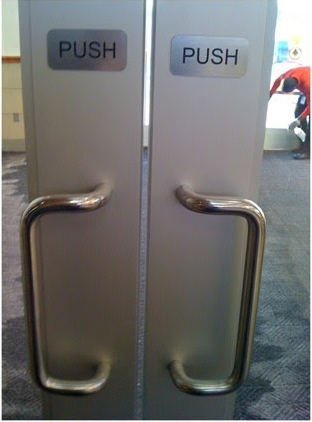
Caption: Your sign says ‘push’ but your handles suggest otherwise. Image credit: The #NormanDoor
Examples and tips
Tip 1: how do we know what to design?
The answer is – always -your users know. The solution is firmly held by the people we’re designing the product or experience for. This is why we need to understand them better so we know what they need as well as what is aesthetically pleasing for them.
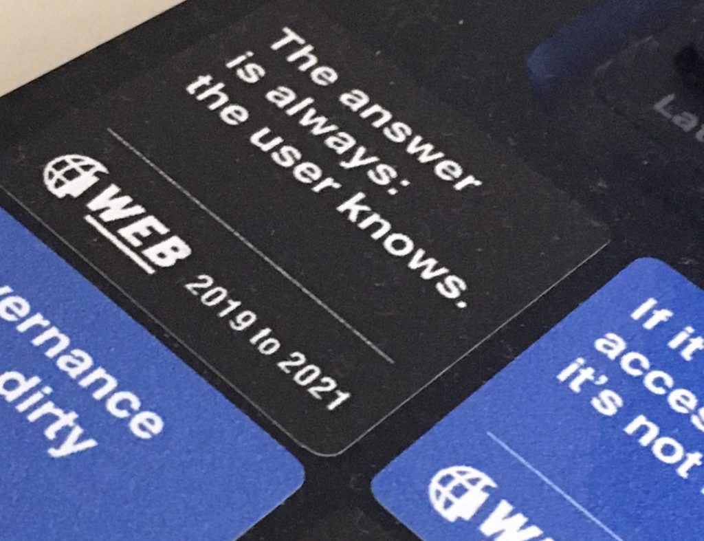
Caption: a OneWeb end of programme sticker: ‘The answer is always: the user knows.’
Your answer is also to start viewing ‘design’ as a series of structured, systematic, intentional decisions. Some of these may not look much like “design” as it is traditionally (and mistakenly) understood (i.e. visual styling). It could be in the form of processes, or structured data, which are some of the layers we have to consider when we design services or interfaces.
For example, text messages from an organisation may not be designed as an official communication channel, therefore causing confusion and preventing users from taking an action resulting in not meeting users and business outcomes. Or say we want to add entry requirements, or related news in multiple areas within a website, rather than creating content multiple times across multiple pages, we can instead structure and manage it in one place, whether we’re publishing it for the first time or the thousandth.
Tip 2: keep things simple
The functionality of products, platforms, and websites must not be undermined. Without it, we are designing our products in the name of art and without a purpose.
Even basics like the photography brief for some new imagery, should always come back to the same principle of fulfilling an intentional purpose: meeting our users’ needs in their own context:
- can I discern the image?
- can I see myself in these spaces?
- are the images authentic?
- am I inspired by your work?
Fundamentally, this is an essential part of creating accessible images and therefore services. You should test what problems these images are there to solve. Your work should be going in front of users, your actual customers, to increase your chances of success and as already mentioned, de-risk issues when you eventually go live.
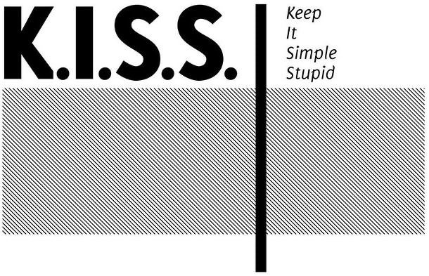
Caption: K.I.S.S. Keep It Stupid Simple. Simplicity is a lot harder than complex, image credit: interaction design foundation
Tip 3: persuasion does not happen at pixel level
As beautifully articulated by Mike Monterio, “a pixel is just a point of proof in the execution”. If we want to design the right way, we are going to have to do it by talking to people. Because designers get hired to solve business problems.
Design isn’t marketing. Both are important but different. Marketing is about persuading users that something is a good idea. Design is about making it self-evident. A product’s usability is often cheaper and easier to address than its persuasiveness, but in order to achieve this with good design, we should not just be feeding in at the beginning or the end of work – good design happens from the start and throughout.
Answering the question of what users want to achieve is done through user research. That is not the same as more traditional market research that has been carried out for years. User research focuses on understanding user needs and how to address them, rather than how to convince them to buy. The emphasis is on observing their behaviour, rather than canvassing their opinion.
As an example, we got insights from user research for some of our study products, which are around building emotional connection. It was all about:
- being able to see the university’s places and spaces, the people (staff and students)
- hearing students tell their stories about their experiences in their own words – all about getting a true insight into their possible future
- being able to feel that this is a good choice for them
This then informed our content strategy in the selection of which content to show. In many cases this is content that hasn’t previously been published, or not published in a way that will meet these needs. A survey or focus group could have possibly suggested some of these insights, but they wouldn’t have allowed us to find, try out and validate the best ways to execute our design solutions.
Tip 4: solving the problem can’t happen until you understand the problem
That generally means talking to people who are experiencing the problem – not your colleagues, or your friend, or your next door neighbour – unless of course they are among the people who will be marginalised as a result of your product design.
There also had to be a socio-economic lens to the design decision making, similar to those in an article by Gareth Ford Williams on socio-economic accessibility. Basically any organisation has to consider the impact of change on users, especially the ones who could be excluded by any bad decisions.
Tip 5: not understanding the scope of your work is a problem
Generally speaking, organisations are not very good at articulating business outcomes, and this makes it much harder to understand the scope of the problem you are trying to solve.
Example: “we need more revenue” is not a problem, it is an observation. Because it is not a problem, it also doesn’t have an actual solution, and if you attempt to seek one, you’ll find yourself bogged down in endless speculation that produces few results.
“Our customers drop off during the onboarding experience, which lowers our conversion rate and is leading to lost revenue” is a problem. It is specific, informed and, perhaps most importantly: actionable. Armed with this, a digital user experience can begin the investigation that will eventually lead to a meaningful answer.
A big part of what design is about is to give us a problem to solve with some measurable outcomes that explain what metrics you are looking to move.
Tip 6: not doing research to understand the problem is a problem
Back to the cake metaphor, it’s always a good idea to make sure that the cake is baked with the right ingredients for the right person. And it’s always a good idea to have a good peek behind the curtains to get your assumptions tested. I am forever grateful for challengers who kicked the tyres during usability testing or prototyping. I’d much rather it happened at that point in time, before the team released something that people cannot use. The real value of user research comes from increasing our understanding of who our users are. With every study, every interview, every interaction, our team gets to know our users a little bit better, including the context in which the users work. Then design, test and iterate!
Gathering the right feedback to understand what will drive the connection with users is a gift. “I like it”, or “this looks good ” is not good feedback because it only gives us part of the picture. It doesn’t tell us if someone can use a service, or what frictions they encounter, and does it do what they need it to do. Data and metrics can’t fully answer these questions and they can’t steer you towards the best solutions. This is why we use both qualitative and quantitative research techniques. Data tells you what is happening, qualitative research tells you why and helps you figure out how to solve problems. We talk to people, we get under the surface of what is happening. Good feedback is done through observations in order to identify how to improve a service or a product. Start by outweighing the evidence. Learn what works, learn what doesn’t work (Ben Holliday).
Frustration costs
When something is not designed it becomes messy. Not joined up. Annoying. Not user-centric. You make your users work extra hard. In a digital world, extra unnecessary work translates to users going elsewhere to get their needs met.
The Design Ladder was developed by the Danish Design Centre in 2001 as a communicative model for illustrating the variation in companies’ use of design. It suggests that when an organisation adopts design as part of its business strategy, there’s a positive link with higher revenue.
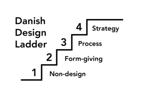
Caption: The Danish Design Centre’s Design Ladder lists four levels of design.
We’re seeing many companies that understand this link. But the truth is large organisations are orientated around themselves, not the end-user.
As a design team, we’re in a position to help users make decisions, but also for our university. This is because poor design is very costly for organisations (Jared Spool). It creates frustrations, generates calls, and increases development costs through rework and waste. It also damages the environment (World Wide Waste, Gerry McGovern).
We’re therefore in a unique position to research and test where poor design costs our organisation money.
In addition, try to ‘flip’ the perspective and see the choices you want to present from the outside. Avoid flooding with options, but bear in mind the balance between users’ time and comfort zones for handling options for a digital product. Guiding them to select between clear options that will get them somewhere quickly will take the work out of the user experience and reward the user and organisations alike.
Using common design tools and patterns, colour, line, contrast, help people consume information and make decisions more easily. “This is specifically the case for designing forms, or when you convince someone to take an action – the way typeface, colour and layout fit together says a lot about a brand and shapes new users’ perceptions.” (Aaron Walter, Designing for Emotion).
Conclusion
Bear in mind that the aesthetic-usability effect has its limits. A pretty design can make users more forgiving of minor usability problems, but not of larger ones.
At the end of the day if:
- the user can’t find the product, the user can’t buy the product.
- the service has multiple interactions that aren’t consistent visually or that haven’t been designed for access, you end up failing those people you were meant to serve in the first place.
Even great-looking sites will have no revenue if they suffer from poor findability. The emotional connection is therefore derived from being able to complete the task efficiently.
From a pragmatic point of view, we need to master the right balance between the design, functionalities, and user experience, planning, thinking ahead, doing deep analysis and being careful and considered in constructing something that will be solid, reusable and stable. Form and function should work together. When interfaces suffer from severe usability issues, or when usability is sacrificed for aesthetics, users tend to lose patience. On the web, people are very quick to leave.
Final notes
There are many important points raised in this article. Many of them are underpinned by good standards and assurance check-points.
If you want to hear more about it, we will be hosting an Ask Me Anything session, and we will be happy to answer your questions then. To find out more first, subscribe to our blog.
Huge thanks go to Mark, Kate, Jonny and Claire for helping make this blog post better.
Links to articles and further resources:
- Aesthetic vs. Function: nailing the balance in UX design (Ayesha Ambreen)
- The Aesthetics Usability effect (NN Group)
- Emotional Design: Why we love (or hate) everyday things (Don Norman)
- A proven method for showing the value of good UX, (Jared Spool)
- Yes Alan, there is an ROI for UX design (Jared Spool)
- Ruined by Design (Mike Monteiro)
- The design ladder (Danish Design Council, issuu document)
- Designing for emotions (Aaron Walter)
- Redefining Hicks Law (Smashing Magazine)
- Intro to UX: The Norman Doors (Jesse Russell Morgan, UX Collective)
- The Weight of Starting (Ben Holliday)
- World Wide Waste (Gerry McGovern)
- Why can inequalities appear in digital accessibility (Gareth Ford Williams)