It’s been just over a month since our OneWeb teams assembled. In that time, our user researchers have met lots of people, seen lots of work going on and had many, many conversations about what they do.
So… what does a user researcher do?
Our OneWeb user researchers fulfil several roles for our teams. They are here to help our teams understand:
- who the users of our services are and what they need from the service. This is because if we’re to build great services, we need to truly empathise with our users.
- what’s the problem the user is trying to solve, what goal are they trying to achieve? How can we support them to achieve their goal?
- whether the solution we’re looking to provide works well and how it can be better
User research is invaluable and it helps decide:
- if we should build/release something at all,
- what that something should be and
- how it should work.
The user has the final say
We’ve stopped thinking we know everything. Instead of assuming we’re always right, we’ve adopted an approach where our decisions are increasingly based on insights. We’re listening to our users more than ever and they inform the direction in which we move.
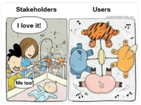
What the users really get to see. From Twitter.
User research shows us how the things we create will fit into users lives. It also gives us insight into the language people use and how they view the world. It helps us understand the problems in their lives they’re trying to solve, the goals they’re trying to achieve, and how our creations can help solve those problems or complete their tasks.
There is also the question of what we’re testing when we do research: we’re testing our designs, we are not testing our users. The user doesn’t pass or fail, the design does.
This is really important when we come to think about the products we’re creating and the language we use.
And this brings me nicely to the user testing we carried out last week.
Undergraduate usability testing
The first part of our delivery is elements of the mammoth user journey: ‘Become an Undergraduate Student’. Nick, our Lead User Researcher, and the team dug deeper to help us understand how prospective undergraduates:
- go about shortlisting universities and courses
- use the University’s website to find course information
- use course page content to compare courses and inform their decision to (or not to) apply
- feel about the new Minimum Viable Product (MVP) course page design that the OneWeb team have developed.
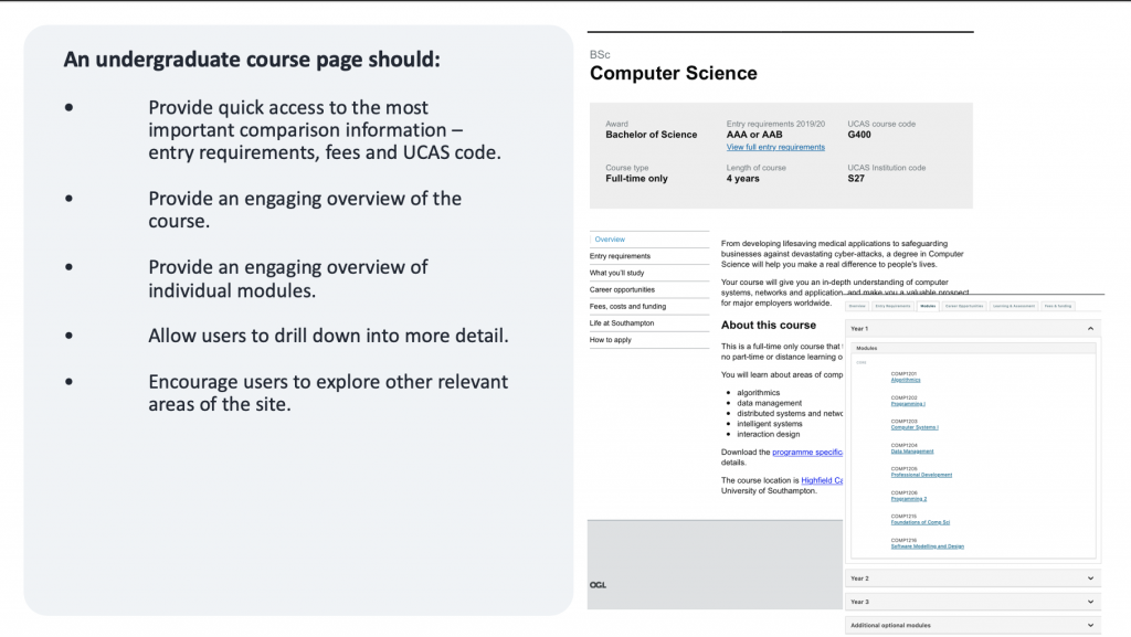
This is the first version of a new course page template designed by the OneWeb team. It’s a white-label prototype.
Here are 5 things that we learned from the tests:
The user journey is complex
The user journey refers to the sequence of events and steps that a prospective undergraduate student will take in deciding where to apply to go to university. This includes the process of picking a course, researching and shortlisting potential universities, and making a final selection to include in a UCAS application.
Although there was some consistency in how users approached this task, the research suggests that the user journey is complex and non-linear, with many start and end points, such as the many third-party resources that help prospective students to select courses.
Course pages need to help users to complete specific tasks
Prospective students described their need to make quick comparisons with other courses on their shortlist. We can help them to do this by providing easier access to basic comparison information (such as entry requirements, fees etc), a good course overview and concise and engaging information about specific course modules.
Secondary requirements includes practical information about the campus, internships, scholarships, access to teaching staff.
MVP design – are we on the right track?
Yes we are! All of the users we spoke to preferred the MVP course page design to the existing website. They liked that it was clean and uncluttered, allowing them easy access to the most important bits of the information they needed to compare courses. They particularly liked the bold summary in the page header, and found the other headings easy to understand and navigate.
The presentation of course module information was the subject of much discussion. Without a shadow of a doubt, we have an important design challenge in finding the appropriate amount of detail for course modules, as well as the most enticing way to describe them.
General navigation problems
We have always known that the existing site has issues around navigation and how users find the information they need. There are many reasons for it, primarily due to legacy issues, vast amounts of content, and problems with search engine optimisation.
As expected, the tests also helped to identify other more general usability issues with the existing website. For example, several participants had problems navigating around the site and finding appropriate course information. Others found that, once they had chosen to explore other areas of the site, they struggled to find their way back to information they were originally interested in.
Clear navigation is an important part of the usability of a website and how effective it is in helping users to achieve their goals. Further research is planned over the coming weeks to help us improve navigation around the website.
What about international students?
The international students we spoke to had a slightly different, global perspective on deciding where to go to university.
As with domestic students, entry requirements are key. They describe international entry requirements as being more complex and having to do more research to understand what is required of them.
The starting point of the journey is different. Often international students will be considering multiple countries to study in as well as different institutions. They use global resources and rankings to help them narrow their searches and decide on where to apply.
Our international participants were particularly positive about efforts made by universities to help them to understand what life on campus might be like, and the support available, when distances prohibit an open day visit.
They describe some universities as being particularly good at helping to overcome the distance by providing:
- virtual tours
- regular video and social media contact with staff and faculty
- access to student union facilities
- contact with other international students at the organisation, particularly those studying in similar areas
One participant described the resulting ‘connectedness’ as a key factor in selecting her firm choice of university.
So what’s next?
This is a really exciting time. The direction we’re moving in is becoming inevitably more digital and evidence-based in order to be as user-centric as we can. We’re facing many challenges and a good amount of user research will enable us to take the OneWeb programme from strength to strength.
This was the first part of our degree course pages iteration. We will continue testing and iterating our product by getting live feedback from our users on a frequent basis.
If you would like to attend one of our forthcoming show and tells, please register here. Thank you for reading!