One year ago, almost to the day, I wrote this:
Nice crop Jonny – well done 🙄
I had just come off a few days of content design training and my head was filled with new ideas that I was excited to bring back to my role as a social media monkey officer for the University of Southampton.
Almost exactly a year later and a little unexpectedly, I’ve just started a new job as a content designer. Having been in the role for a month now, this feels like a good time to reflect and update.
The last blog talked a big game about the theory of content design, but how does it all work in practice? Here’s what I’ve learned:
It’s a bit like solving puzzles
When I’m not pretending to be a functioning adult human being, I play a lot of videogames.
A lot.
The content design process isn’t all that different to a videogame. You have:
- a goal
- some rules about how you can achieve your goal
- a few obstacles you’ll have to overcome to get there
Our team is currently updating the University’s postgraduate taught (PGT) course pages. Granted, this ‘game’ wouldn’t win many awards in the gaming industry, but here’s how it plays:
- Goal: make our PGT course pages as user-friendly as possible, so that our users can do what they came here to do as easily as possible.
- Rules: the content must be accessible, digestible and accurate. And it has to capture the attention of prospective students.
- Obstacles: the information and resources we need in order to do this are often fragmented, inconsistent or non-existent.
As you can imagine, this game calls on us to be resourceful and adaptable. We learn new things every day. Sometimes this means we move forward, and other times it means a few steps back to change things based on new information.
Of course, there’s no sense in playing if you don’t keep score!
We’ll be using analytics and other performance indicators to see how the changes we’ve made affect our users’ behaviour on the website. We’ll know we’ve won when we have data to show that they are completing their goals more easily than before.
Room for creativity
My early impression of the content design approach to writing copy was that, while effective, it would result in a lot of homogenisation. Can you really be creative when you’re confined to writing in Plain English, adhering to a style-guide, and (at least in this case) following a very prescriptive template?

A far cry from the dizzying literary heights of Twitter-based duck poetry.
Turns out: yes, you can.
We’re a team of 6 content designers, all following the same guidance and rules, with all of our work being reviewed and signed off by the same people. And yet our output has so much variation that we can easily tell who’s written what.
That’s not to say we’re being inconsistent in quality; the main beats are all there no matter whose content you look at. But even when you’ve accounted for all of the similarities, there’s still loads of room for personal style!
That’s good for us because we get to be creative in our work. More importantly though, it’s good for the user because the content flows naturally and is easy to act upon.
There’s no substitute for due diligence
Here’s a look at the steps we take when we’re working on a PGT course page:
- Gather our sources. At the moment we’re using a combination of the following to inform our content:
- current live course page
- programme specification
- curriculum and module information
- faculty subject brochure
- Complete each field in the template for the new course page, using this information.
- Review the first draft ourselves to ensure it’s accurate and hasn’t missed anything important.
- Submit for review by our senior content designer, John, who suggests improvements based on established content design principles.
- Update the template based on his feedback.
- And finally, factcheck the content with a subject matter expert (SME). In this case, that’s the course leader.
Recent developments in the wider world have made step 6 a little trickier to manage at the moment, but we’ll be getting onto it at the first chance we have. What I want to illustrate here is that every piece of content goes through several passes before going live.
It’s practically impossible to keep every single content design principle front of mind while you’re creating. Does this content work for someone using a screen-reader? What about someone whose first language isn’t English? Or someone who only has 20 minutes to look at it before they pick up their kids from school?
On top of that, human brains tend to get a bit fried after a few hours of staring at a screen. There’s only so much creative work you can do before you’re burned out for the day.
For these reasons, it’s vital to go over things more than once with a fresh perspective each time. We have to make sure that this content serves everyone, not just us.
Speaking of which…
Nothing works without empathy
Our mantra is ‘user needs first’.
What this means in practice is forgetting everything you think you know about what people need. As a budding content designer, I have had to learn very quickly that unfounded assumptions won’t get me very far.
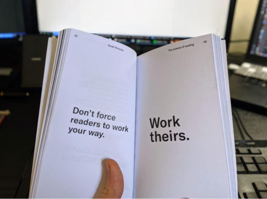
Sarah Richards, Content Design
You need to take a step back and put yourself in other people’s shoes. You need to see things from their point of view, and use any empirical evidence you’ve gathered about this to inform everything you do.
Empathy is a skill you can learn, just like any other. If you’ve never needed to use a screen-reader to get information from a webpage, it may not immediately occur to you that something you’ve written won’t play well with such a tool. It takes practice to start seeing the world differently to the way you always have before.
It’s not just users though. We have other stakeholders to work with and their perspective is valid too. We’re conscious that we’ll eventually be sitting down with course leaders to go over changes we’ve made to content they spent days, maybe even weeks putting together.
When that time comes, empathy will be the difference between ‘correction’ and ‘collaboration’. This is not an exercise in telling our SMEs that their hard work is somehow wrong. Our goal is to work with them to make sure we’ve captured everything they want to say in a way that works for everyone who reads it. We can’t do that unless we understand their hopes and concerns too.
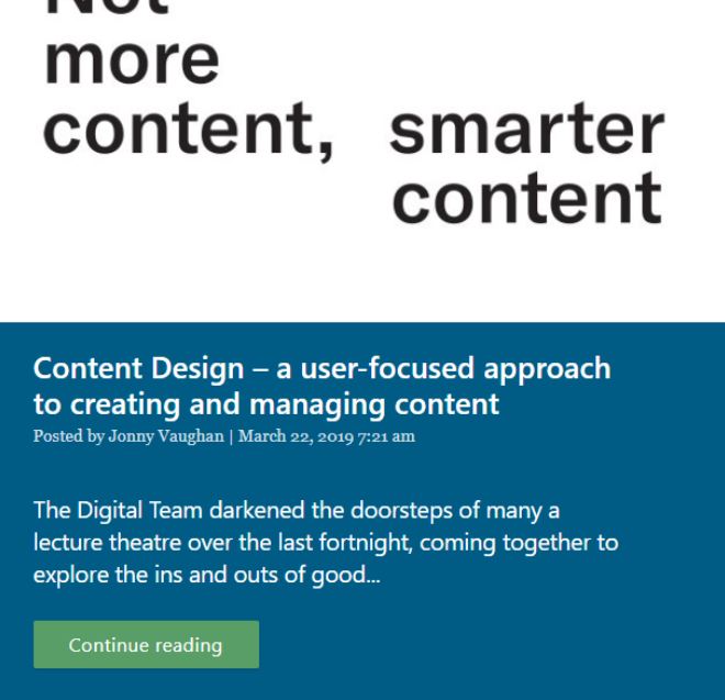
Same content. Different user experience.
I’ll leave it there for now. I hope this has given you a useful insight into the work going on behind the scenes at OneWeb HQ. If you’re eager to learn more, I recommend having a look at this post on user research by fellow content designer, Claire Furnish.
If you have any questions, please get in touch!