On 31 July we completed a large part of our OneWeb delivery, including the build of the core of our new website, which will be live soon.
In this blog post, I would like to take a moment to share a few things that we’ve learned along the way. I will cover some thoughts on collaboration (especially at uncertain times), designing with users and trying to keep sane. 😃
As a follow up to our end of phase retrospective, and just before we start with another huge stakeholder engagement effort, here are a few thoughts from a period of tremendous effort from my team.
Delivering a chunky programme phase is never more uncertain than when a global pandemic arrives at your doorstep.
#1. Create services and products that meet user needs
This may sound obvious: only design, write, develop services and products that meet a real person’s needs. Over the last few months, I have witnessed a huge increase in the demand for my team’s skills at a particular time where everything feels urgent. ‘Getting pulled in different directions’ was one of the main themes in our team’s retro – something I also experienced first hand.
Whilst we weathered the storm, I feel it is important to remind my colleagues across the University, who understandably sought fast solutions to complex problems, that (external) users who come looking for our services have a choice. They can easily go elsewhere and find an institution that will meet their needs better than we do. With difficult times upon us and more still on the horizon, reducing unnecessary choice and burdens for our users have become more important than ever.
There were many occasions in this phase where I had to ‘stick to my guns’ and express the importance of going through a user-centred design process properly (albeit rapidly or retrospectively at times) and advocating for our users. For example, if you’re a student who is about to start your journey at any given university, how critical is a good digital experience when no physical events or learning can take place?
I think there might be a misconception that user centred design (UCD) is a lengthy product development process. It doesn’t have to be. I’m grateful for the colleagues who have witnessed first hand the speed at which products can be created and delivered. They have put a lot of faith into our practice.
At the same time, in some areas we have seen knee-jerk solutions pushed through, which have not fully considered the problem they are attempting to solve. What would a good benchmark or KPI look like? How is it going to be evidenced? Issues and challenges that we’ve all been aware of for years have been magnified to the extreme because – guess what – when you design a digital service, the backend office gets exposed, and that’s not always a pretty sight!
#2. Simplicity isn’t simple, consistency is even harder
Holding the line is hard. Over the last few months, we conducted design research throughout the product build, facilitating multiple rounds of moderated usability testing to make sure we’re building the right thing for people as quickly as possible.
Some of our new designs may look very simple. But to get there we had to iterate several times as we developed our understanding of our users through their inclusion at all stages of design and testing. Our multidisciplinary teams relied and acted on users’ first-hand knowledge and feedback throughout, making it a point never to trust our first assumptions.
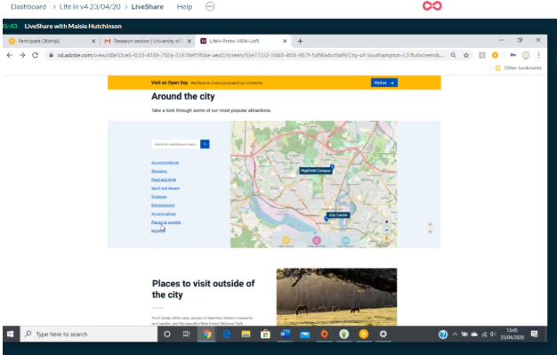
 User testing in progress: only hard work makes things simple
#3. Users, not audiences
Audiences and users are not the same thing. The products we design and the content we write might have more than one user with a range of different needs. It’s not enough to imagine one kind of user.
One of my team members, Maria, said “just because we think that something might be the right thing to do, unless it’s proven by the real users, it’s not”.
Empirical evidence is the cornerstone of all good decision-making. You need to do research to learn about the range of users and their contexts. It’s important to find out about their specific and diverse needs, such as:
- another language other than English
- assistive technology they use to read content
- the range of devices they use to access information
- availability and quality of their internet connection
- other (non-digital) ways to access content
Accessibility requirements are an absolute must and one of our key guiding principles. We have to conform to WCAG 2.1 AA compliance and it is also an important requirement to meet user needs.
We’ve just completed an independent accessibility audit and we’re working through it to address some fundamentals before release. But it all becomes much more challenging when other teams don’t necessarily work in the same way as you. This results in a solution that, while technically correct, does not stand up to user needs scrutiny and is now too late to change.
Projects and activities should have a desired outcome – the anchor point. This remains fixed whilst the problem and solutions can change. For example:
- a problem to be solved: departments aren’t sharing enough data
- a solution to be implemented: what we need is a university-wide data sharing framework
- an outcome to be achieved: we want all departments to be able to easily access the information they need, in whatever format it might be held.
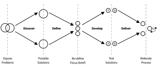
 Outcomes based solution: the Design Council’s double diamond model
Moving towards our desired outcome may raise additional practical questions, such as:
- What’s the easiest way to learn this fact?
- Where should you go if you want to find out more?
- Does this image and its position on the page help communicate a useful point?
The answer, always, is: the user knows.
We must adopt a different posture as an organisation, as stakeholders, and as colleagues – our opinions might be interesting, but are unlikely to be the final answer. Don’t seek to argue – seek to understand.
This might be unsettling to some because it contradicts many preconceived ideas about the way we should do things. We’re encouraging you to take this journey with us. It has great potential to change your perception of the problem and solution for the better.
#4. Working with us early
In large organisations there are always services, systems and content owned by other teams within the organisation. By far one of the most challenging parts of running a multi-year transformation programme is managing content requests as part of the business-as-usual workflow.
We’re currently working on a new easy step-by-step guide to help our team and stakeholders manage their content, provide feedback and suggestions. A few critical observations from recent activities may offer some further enlightenment to others who find themselves in the same situation:
Not all content is equal.
To understand what works and what doesn’t you need to identify what content is (and isn’t) used. Generally speaking, the more content you have, the more complexity you add for the user. There is no excuse for failing to analyse and evaluate your content, how it is performing, and how your users are accessing and consuming it. Put simply: you can’t measure your success (or need to improve) without measuring anything at all.
There is no substitute for observing people interacting with your services.
Watch your users struggle, do some readability tests, identify their pain points and respond accordingly by iterating your product. I know that user research is a craft, and we’re lucky to have a few in our teams. But even if you don’t have access to a user researcher, or you’re unable to talk to users, there are some things that you can do, such as desk research.
Some content, websites and products need to retire.
Digital services and content, like all living things, have a lifecycle and lifespan. It helps if you have maintenance reviews where you take a look at performance analytics and user feedback to flag up areas that may need to be removed. This is something we are looking to address very soon.
I still don’t get FAQs.
Our organisation, like many others, still feels that FAQs are an effective way to communicate important information. They are not. Good structured content really matters. Information Architecture (IA) really matters. We know people don’t think in terms of neatly framed questions and FAQs don’t assist natural online reading behaviour. They make the user do the hard work and are inherently antagonistic to good IA.
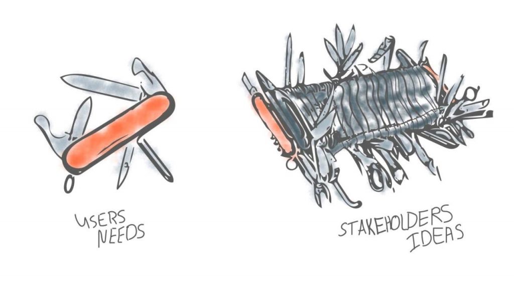
Just by writing this, I can sense the palpitations of any content designer taking on a long list of FAQs, and trying to turn it into something useful against a tight deadline! This is also frustrating because it feels like we’re letting users down by not doing an adequate job in communicating vital information as effectively as we could. The misalignment between stakeholder perspectives and real user needs is the elephant in the room that needs addressing.
 Caption: what the user really wants. From #productdesign thread
Engage with us early.
Traditional ways of working have created habits that are difficult to break. The ‘right time’ to engage with our programme is often significantly earlier in the process than what our colleagues are used to. Ideally, we’d really like to ensure content design input is included from the inception of any relevant project, allowing us to work alongside colleagues who are strong subject matter experts from the very beginning. Content designers and other UX disciplines can provide invaluable points of view by representing the voice of the end user. We’re genuinely stronger when we work together, and it’s so much harder to implement good design at the end of a more traditional process.
Looking ahead
Over the last phase we’ve done as much as we can to tackle some difficult issues and we’ve tried to develop some shared understanding – in and outside our teams. Putting users first can be hard and uncomfortable. Especially outside the protected scope of the programme. It’s a big shift for a lot of people and getting some to change or compromise, even a little, is hard.
This work matters. The teams are amazing. And now more than ever we have a massive role to play in the future of our university.
I look forward to seeing what new lessons we will learn along the next phase. Also worth remembering – nothing worth having is easily gained. 💪
Our Show and Tells and product recording can be found in our University SharePoint site.
With thanks to all my contributors: Mark, Kate, Joe, Jonny, Andy and Maria.