Over the past few years, and especially since the global pandemic where many physical activities have moved online, it has become more important than ever to ask ourselves how to make our web services more energy efficient and reduce their carbon footprint.
As someone who has always worked in digital roles, I thought for a long time that moving everything online would make me happy. But fresh insights bring fresh perspectives, and I’ve become more cautious about the ways in which we use digital tools to tackle real world challenges.
The environmental impact of the Internet has brought a new sense of urgency to many digital practitioners, including myself, over the past decade. If this topic is new to you, then in essence the Internet – everything from data centres, to telecoms networks and end-user devices like phones and laptops – uses a lot of electricity. In fact, if you add it all together, the internet uses roughly the same amount of electricity as the entire United Kingdom, one of the world’s largest economies (Tom Greenwood, Sustainable Web Design).
In this blog post, I acknowledge what we are doing as a digital user experience team, some of our ongoing challenges as part of the OneWeb programme, and also what other steps we need to take, collectively and individually, to tackle this issue.
#1. Simple, small and effective content has a lower environmental burden
Simple, small and effective content is good for the environment and also better for your users, and you!
Design and content have a big impact on energy efficiency. From search engine optimisation (SEO), content design, and use of images, videos, fonts, to code and design choices. Running a popular digital service always has a cost associated with it, but we don’t tend to factor in the cost to the environment. The assumption is often that digital means green, but this is far from the truth.
In the words of Gerry McGovern, author of World Wide Waste:
“Our ability to create stuff using digital tools far outstrips our ability (or willingness) to organize and manage what we have created. Dealing with the consequences of easy production and poor content management is a growing challenge”. – @gerrymcgovern
To illustrate Gerry’s point I’ve included a snapshot from our 2018 content audit where we estimated our digital web estate to contain roughly 4 million web pages. Only 156,000 of these have been accessed in the last 3 years and just 8,000 pages account for 90% of all traffic to our digital estate.
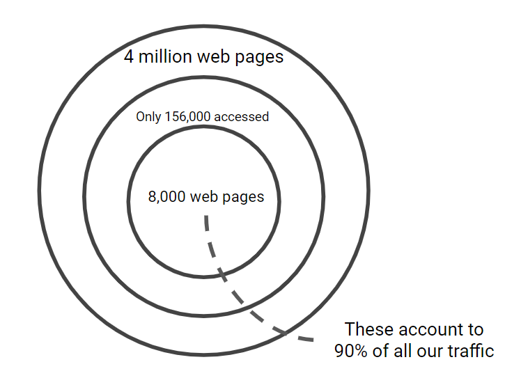
Caption: representation of access to our web content, 2018
COVID-19 may have reduced traffic emissions, but it exacted a toll elsewhere for this saving. Like many other academic institutions this past year, education had to be delivered online. The University’s daily contribution to global carbon emissions as a result of online lectures and staff meetings is likely equal to that of someone flying from London to New York¹. Given this additional burden, there is even more reason to consider how we make content that is designed to last, and how we focus on completing meaningful tasks rather than ‘vanity projects’ that needlessly consume time, energy and budgets…
Now – Southampton is not unique in this matter. This is a consistent problem for almost every large, complex organisation.
There are many reasons why an organisation’s digital estate becomes unnecessarily bloated and so much content goes unvisited. It might be that:
- the content and underlying service are not designed to meet user needs
- the content is inaccessible to a large number of users because of poor positioning or broader accessibility and user experience (UX) issues
- constantly seeking the next new thing which makes it harder to argue for review and maintenance ahead of creation… a challenge we’ve already discussed in this blog post about digital governance
¹Roughly 4.5GB of data will be sent across the internet if 20 people join a Microsoft Teams video call for 1 hour, all with their webcams broadcasting Standard Definition video. This doubles if everyone broadcasts HD video. If the University delivers 50 online lectures or virtual staff meetings like this every day, between 225GB and 550GB of data will be sent across the internet. It is estimated that transferring 1GB of data generates 3KG of carbon. So, 225GB of data generates 675KG of carbon. A London to New York flight generates roughly 0.67 tons of carbon per passenger.
#2. Whack-a-mole with platforms and systems
I’ve never said that OneWeb is the silver bullet to all our organisational problems. However, thanks to the boldness of our University in trying to deal with it, it is a step towards a better standing point, which includes the reduction in size and therefore cost of maintaining our web estate. We didn’t necessarily plan around adding to the green credentials of the University, but this will be one of the longer term outcomes of the programme as we pare back and simplify to only what’s needed to meet user needs and help them complete tasks.
We’re working as fast as we can, trying to address all the legacy issues around content creation and maintenance, which are only the tip of the iceberg. As we’re working our way through, however, we’re reducing and figuring out some of the answers to long-term maintenance and support, as more and more platforms and systems crop up all over the place.
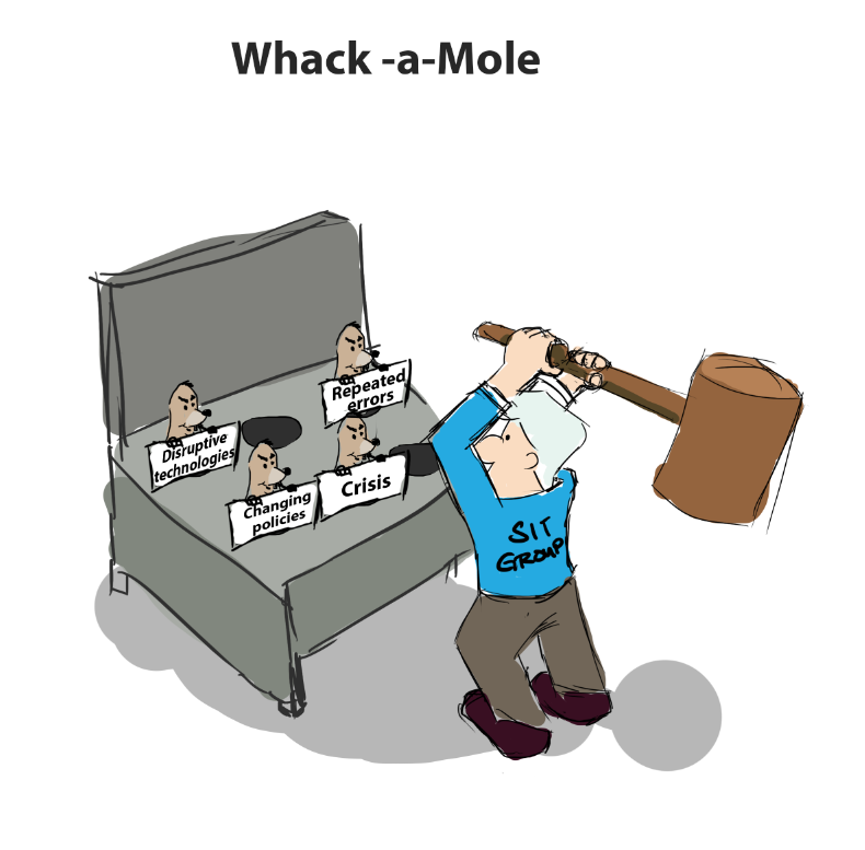
Caption: Whack-a-mole with systems and platforms, image credit: learning solutions
I do appreciate that some of these appear for very good reasons, for example, in response to urgent policies and compliance requirements. However, the lack of forward thinking and the burden this creates for users, as well as the impact to our planet, go against our best interests as a society, organisation and individuals with sustainability targets in mind. Platforms that do not meet people’s expectations undermine the credibility of the service and of the University.
And this is a good place to segue to the other side of digital sustainability ethos: fairer, more equitable design.
#3. JEDI is not just a force for good in galaxies far, far away
The Justice, Equity, Diversity, Inclusion (JEDI) framework supports creating digital products and services that are fair and open to all.
As mentioned at the start, it is important not only to promote these principles, but to fold them into the very fabric of our projects. A project ethos with JEDI at its core is less likely to alienate the people working on it as well as its potential audience (whether intended or unintended).
So, how do we incorporate these principles into our own design practice?
Equality and justice in digital design is a question of opening up opportunities for users by making our information and processes more transparent, and more available. Right now, we are employing design thinking around PhD level, where currently the information needed is scattered to the winds, the application process is opaque and specific opportunities are hidden. We’re bringing everything a potential candidate would need together and creating intuitive user journeys, while also adding guidance so that anyone from any background can easily gain an understanding of information they need.
Plain English layer
Embedding Plain English and accessibility principles in all our digital content is an exercise in inclusivity. We specifically aim not to exclude anyone, whether they:
- don’t have English as a first language
- have a disability
- are looking at our content while multi-tasking, for example looking after family
- are simply not initiated in the subject area yet
Our users are diverse people with diverse needs that change from journey to journey. We should design our services to reflect this.
There are obvious social equality issues that factor into our users’ backgrounds and circumstances. One way we aim to improve things is by applying a ‘plain English layer’ to things like research projects, which we expect will also help with discoverability through search.
Diverse communities
Our aim for the new subject areas pages (currently in prototyping stage) is to create a strong sense of place. We are assisting potential students in their desire to imagine themselves ‘there’. ‘There’ means physical spaces like facilities but it also means community – people. We need to reflect the diverse community and culture at Southampton, as we know that’s really important to all our users.
Part of Kat Holmes’ Inclusive Design Toolkit (developed for Microsoft) reveals that we should be thinking about variations in access and inclusion when we think about user personas. It is a good reminder of situational inclusion. We think there’s another layer (socio-economic) that would lead to some people having greater situational needs than others. Perhaps particularly when we’re talking about access to tertiary education. This could also be exacerbated by the global pandemic.
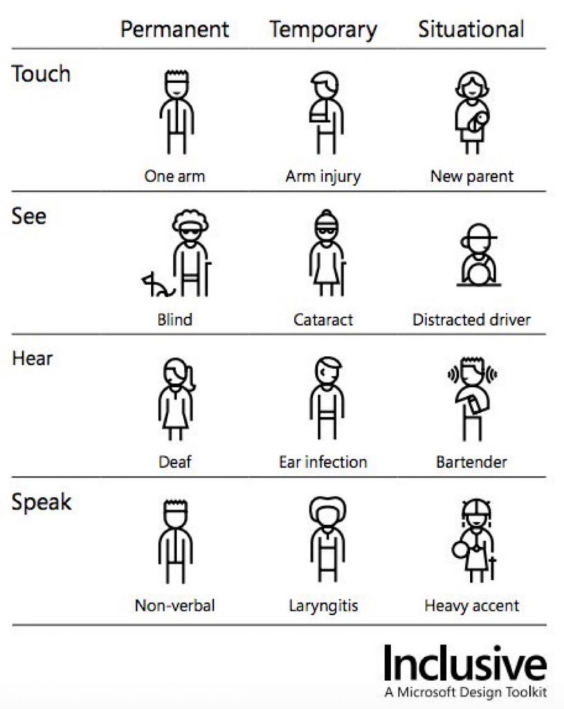
Image: Microsoft Design Toolkit by Kat Holmes
#4. With a great website comes great responsibility
“The world is working exactly as designed. And it’s not working very well. Which means we need to do a better job of designing it. Design is a craft with an amazing amount of power…Design is a craft with responsibility” – Ruined by Design, Mike Monterio
Reduce, reuse, recycle…
Our evolving design system promotes a coherent, familiar and shared design language underpinned by design principles which support the principle of access for all. It ensures design patterns are reused, work isn’t repeated and user experience can be sustained.
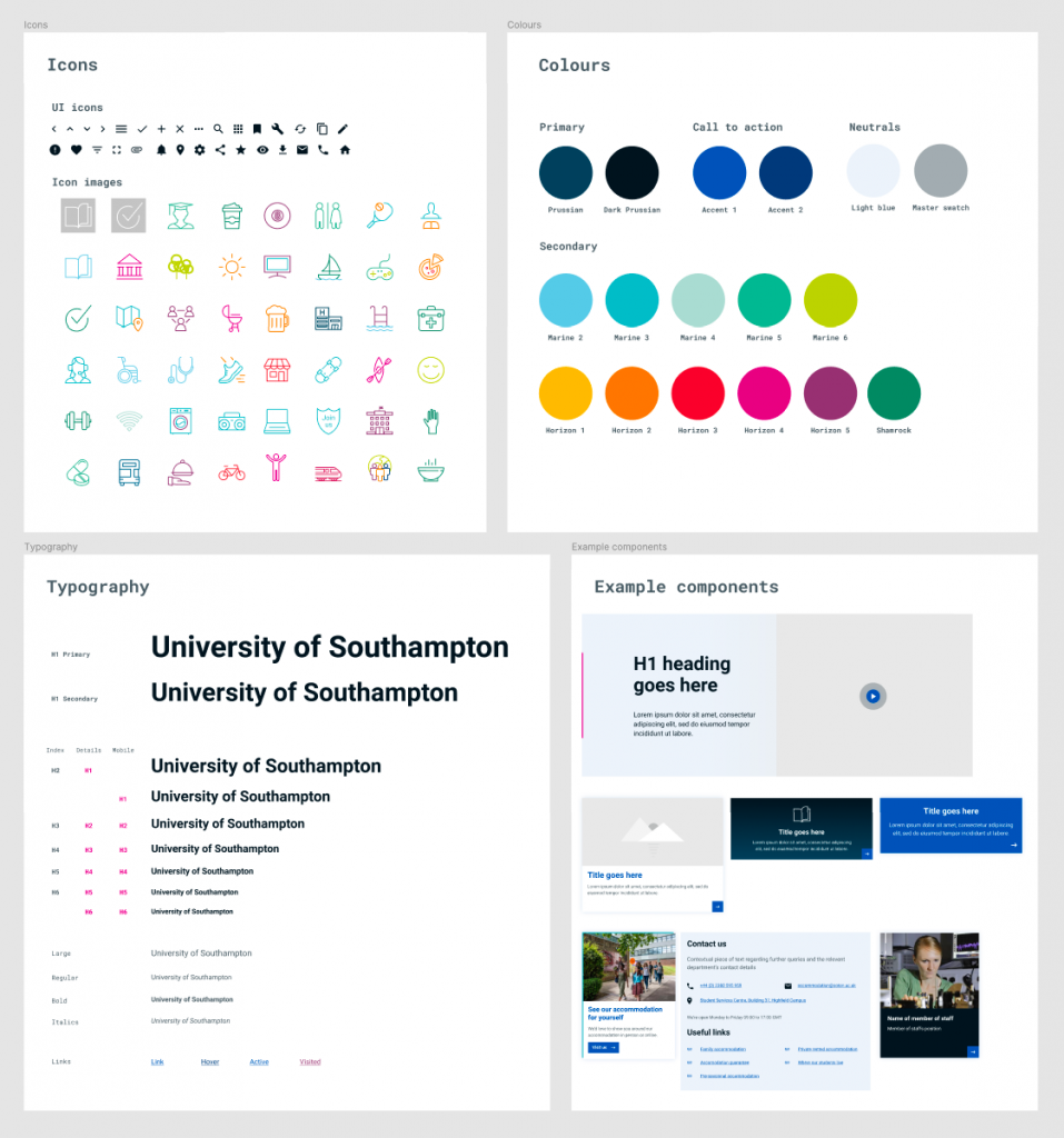
Our evolving design system
As we redesign new services, we’re working with external accessibility organisations to independently assess our designs to ensure they meet WCAG 2.1 AA accessibility standards so that people can easily access and use our services, regardless of any physical or mental disability.
Third-party supplier products are vetted as part of our procurement process to ensure they meet user needs, adhere to accessibility guidelines and provide an experience consistent with our existing products.
We work with existing suppliers to help improve the accessibility of their products with immediate fixes and feed into their product development roadmaps.
Our Student life section of the site has been redesigned for simplified journeys with more direct routes to completing key user goals. For example, applying for accommodation now follows patterns users are familiar with on commercial sites, allowing them to select rooms and locations which meet their individual needs. Users can now easily compare and save the key details of their accommodation options before applying.
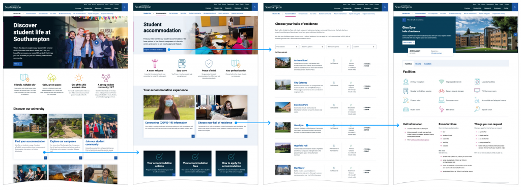
Accommodation journey with key user goals
We have worked to harmonise the experience on the site and our third-party application system. Immediate changes included aligning and simplifying language and applying consistent design patterns. Changes to interactions and journeys require product development and have been fed into the supplier’s roadmap.
Journeys are supported by imagery and student stories showing the diverse community of people actively engaged in university life, but only when they meet user needs and add value. They help give users a feel for the place, what they can do, and what their lives might be like there.
Data, and being responsible with it
One of our principles is to, where useful, ingest existing data from various university systems to products and services. It’s then surfaced to users in focused locations in a familiar and accessible format. For example, staff profiles, which link staff to their research work, teaching activities and associations with organisations and people, now automatically base much of their structure on other reliable data sources.
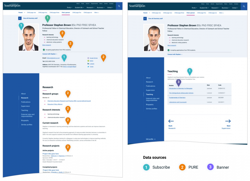
Image: visualisation of staff profile product with key data sources
Ultimately this saves time for our internal users and allows our digital experts to concentrate on more involved tasks, as well as supporting a wide breadth of external user journeys. It also promotes one true source for structured data, accuracy and reduced maintenance overhead in the longer term. It will therefore be easier to sustain in the future, or innovate new solutions around user needs and have data that is used in a responsible and ethical way.
Conclusion: Behaviour change starts with the organisation
We have a lot more work to do. We’re at the start of a much bigger journey. As part of OneWeb, we are helping colleagues to streamline and organise our web estate, making it quicker for people to find the information they need. This in itself will help reduce our impact on the environment. But that’s not enough.
We have to change our behaviour, as individuals and organisations. Technology is rarely the key challenge:
- organising content is key
- focusing on quality over quantity is key
- designing to last is key
For some people, web content, and ‘digital’ feel cheap, easy to create and store – rather like ‘fast-fashion’. Many are used to ‘print’ and are concerned with perfection and completeness before publishing so content isn’t working as hard to meet people’s expectations. Why is that? Our key problems are social, not technological.
If user centred design is all about understanding people’s needs and delivering services that meet them, then it follows that we should consider the impact of those services have on our users and, by extension, our planet.
In the next few months, we will deliver a new digital user experience strategy, which will include guiding principles and governance. We’d like to hear from you as we get round to introduce it.
Please sign up to hear more about it. Thanks for reading.
My immense thanks to all my contributors: Mark, Dan, Steve, Kate, Jonny.
Resources we learn from:
- World Wide Waste by Gerry McGovern
- Sustainable Web Design by Tom Greenwood
- The Ethical Design Handbook by Smashing Magazine
- Inclusive design toolkit from Kat Holmes for Microsoft
- Ruined by Design
- Principles for sustainable services by Snook
- Future ethics by Cennydd Bowles
- Good Services by Lou Downe