Imagine a world where university content is connected, easy to find and follow.
Imagine a world where our course (programme) pages are easy to understand and benchmark well against competitors and existing course pages.
Imagine a world where user needs are brought together with university policies, rules and goals, to create joined up experiences that help our users to do what they want to do instead of confuse them.
Okay, you get the gist – as the financial year draws to a close, so too does phase one of OneWeb. It has been short (we officially started in April), relentless and, it would be fair to say, not without its challenges. Nevertheless, we have delivered what we promised – in a very short space of time!
Thank you
Before I go any further a few thank yous are due to all who contributed to this phase. First and foremost: my team.
This team is tough and resilient – and they rose to every challenge along the way. The one consistent thing about change or transformation projects is that you’ll encounter issues and difficulties. This is perfectly natural, but can breed uncertainty. The challenge for us has been to maintain our focus on delivering genuine value and working through problems without getting bogged down. We kept going despite the inherent difficulties.
Thanks also to our stakeholders: the Advisory Group and Programme Board members who have been looking at ways of helping us and navigating through many of the University’s processes and internal complexities.
And of course a very big thank you to all colleagues who worked very hard to help us meet short deadlines despite being very stretched themselves. We know it wasn’t easy, and we really appreciate it. Without you, our job would not have been possible!
Here’s a summary of what the last few weeks of delivery have been like.
OneWeb Financial Year 1
The main focus of this financial year was around the delivery of our university’s key product pages for the undergraduate (UG) journey. It wasn’t the only thing we addressed as part of the UG journey – many of you contributed to our understanding, either through workshops, interviews, design sprint, or the meetings that helped us with some of the nuances around the journey.
We also made time to deliver a couple of significant discoveries around Postgrad Taught (PGT) user journey and Research, with main focus on REF since it is a university strategic priority. So quite a lot in a short space of time.
For now, let me update you on the UG course pages and what are the plans prior to launch…
UG Course Pages: what are the problems we are trying to solve?
We wrote about issues with duplication, information architecture, governance, and compliance (e.g. CMA), but when we started a few months ago we had very conflicting pieces of information about how many programmes we actually offer and who is accountable for them. So the first thing we did was a comprehensive audit of the content we had, how it was distributed and how it was performing. This in itself was a valuable piece of work for the University.
When designing solutions, we started with a real paired-back version of a course page, initially as basic wireframes for the content, which through several iterations, became a designed prototype that our developer used to build the page. By the end of April we had a minimum viable product (MVP) which was used to complete the first round of testing with prospective students. By this point, we already knew that the key facts tested well with users. We also found out further details that users would like to see on the existing UoS website and competitor sites.
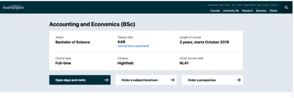
New key facts section
Since then, we’ve completed five rounds of user testing (pretty much every couple of weeks). We talked to users about structure, navigation and generally how they consume the content. More importantly, we observed how they searched for and used the content to complete the tasks they needed to do.
Our research tells us that people are often unsure about the information we (and competitors) provide when interacting with universities. This can result in people not applying for the right course, or applying to a course that they have no chance of getting on because the entry requirements or grades are not clear. In addition, because they do not understand all the terminology at that point, they’re also missing some vital information about the awards we offer, the location of the course, options and more.
What we’re doing about it
So, in creating a new design of the course pages, we are trying to remove all the barriers we may inadvertently put in place when users compare and find the courses they would like to apply for. For universities, managing complex legislation and associated compliance issues presents challenges when delivering digital services. It’s no stretch to say that our own internal processes are contributory to some of the usability issues we found, and as a result this has also led to inconsistencies in information. This is something this particular phase has highlighted in a significant way.
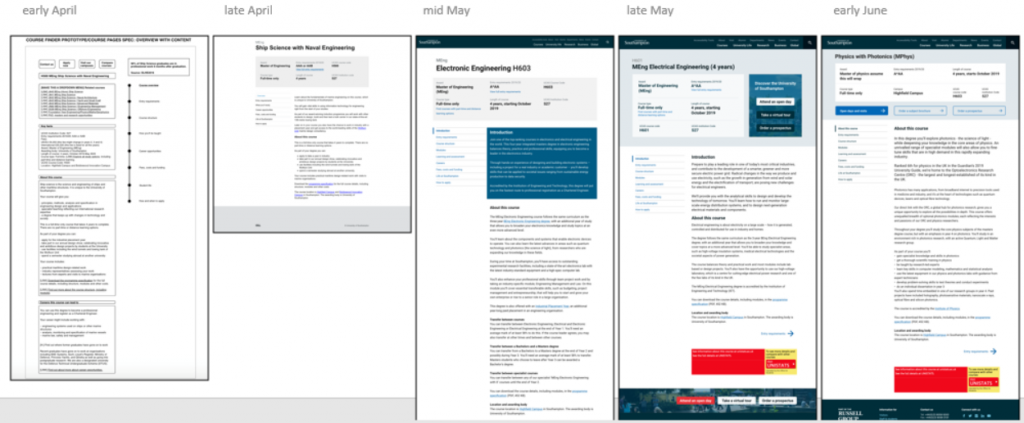
Our course page evolution April to June 2019
But let’s be clear, these problems are not unique to Southampton. Universities around the world are exploring how can they simplify admission information and compliance issues for users. And there is a real challenge tackling legislation, policy and rules in a consumable and accessible way for users.
Why this is important
As a result of only a few months’ hard work, we now have a digital product (aka course page) that users can navigate, scan and retrieve information from with ease. And it’s a well-tested product.
In total we completed over 25 hours of user testing with prospective students:
- All prospective students in testing commented on the clear and simple design and layout. Here’s Liam on the importance of simple and clean design.
- They like the Key Facts box which allows easy comparison with other courses.
- They found that the concise text and improved use of white space makes it easier to scan and retrieve the most relevant information.
- Left-hand menu is coherent and improves navigation.
- The design improves accessibility.
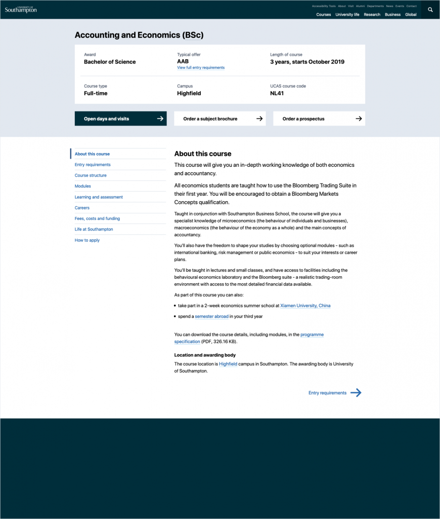
An example undergraduate course page
What else are we doing?
The scope for this phase was to complete all UG course pages. These will be launched in September. During the summer, we will be setting up some drop-in sessions for you to come and see the finished product. These will be informal and any of you are welcome to pay us a visit.
👉 If you would like to subscribe to our mailing list, we will drop you a note when these take place.
But our work is not done. This is only the beginning of a very busy multi-year delivery.
Step one was to reduce content, simplify the design and improve usability – done. Step two is to interweave rich content (videos, pictures and much more) to encourage exploration of secondary user needs. This is where things get interesting and where we incorporate the learnings from our work on the research and PGT discoveries. And any existing live pages will now be continuously curated to ensure they meet user needs.
What have we learned so far
Some of the key insights from our initial delivery phase include:
Taking a human and digital first approach
It’s not only important to focus on how we might make it easier for a machine to consume and crawl our information (e.g. Google search), but also how we might make it easier for humans to read and use our information. There is potential for us to do both.
Bridging the gap between content and coding
Instead of working in separate teams, we have found we work best when content designers, developers and user researchers come together as a multi-disciplinary team to test and design future approaches.
There is value in small bites
We know there is a lot of complexity in this space and because of this it is important to start small and iterate. We think there will be some key opportunities that are small in scope but could deliver significant value.
Parting words
There is a lot to do, however, we have already seen the value of bringing together people from diverse roles, skill sets and subject matter expertise.
In the next few weeks we will further define best practice principles and ways of working and we plan on giving you more opportunities to get in touch with us and be involved.
So to conclude, the last few months have been a taster of all there is to come.
- Did we think this was ever going to be simple? No.
- Did we work collectively and respectfully with colleagues to achieve it? Yes.
- Is there still room for improvement? Absolutely.
We can always do better, and this is exactly what we’re striving to do.
👉 As always, we would love to hear from you. If you would like more information, or track progress, please get in touch.